
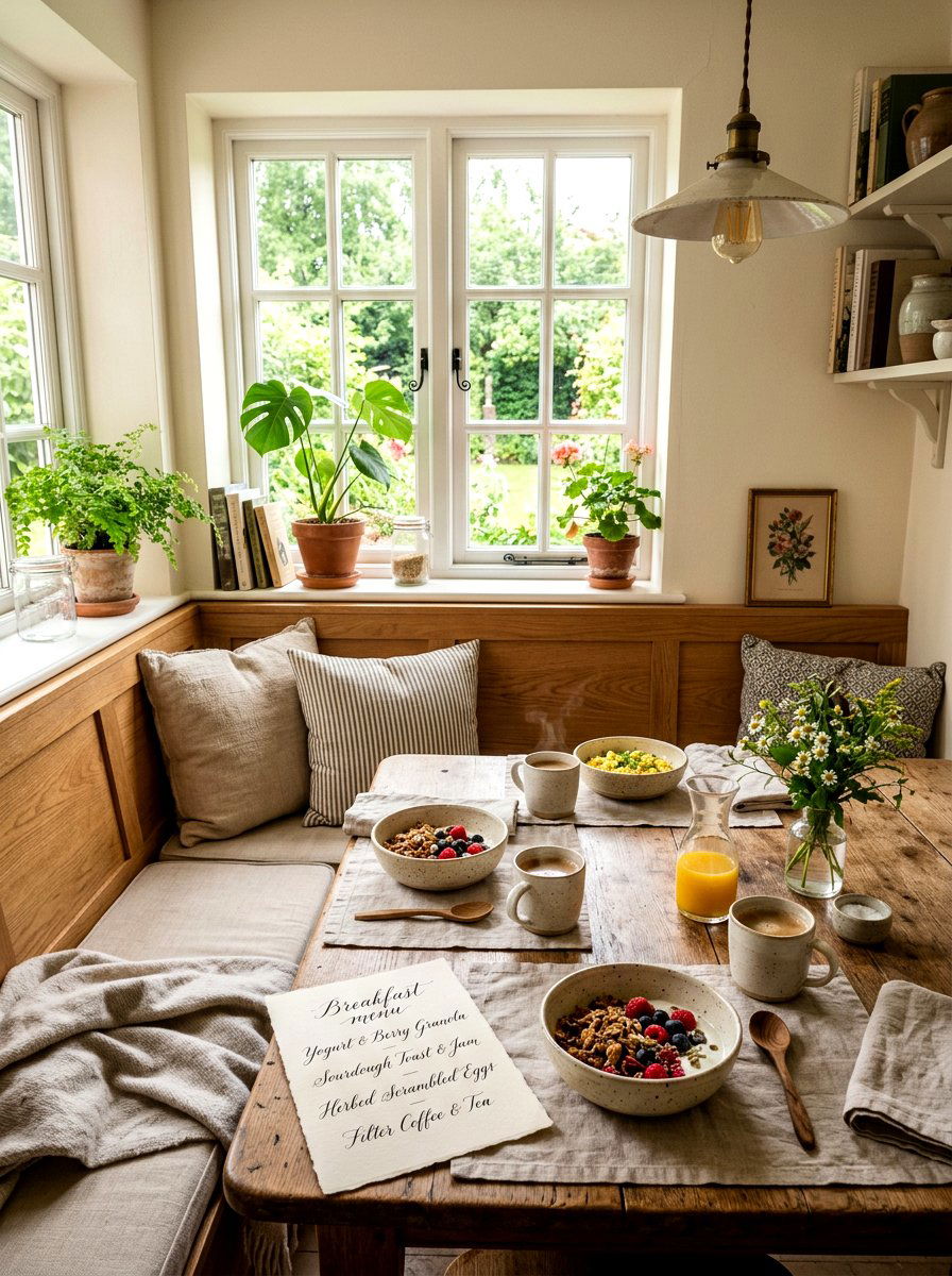
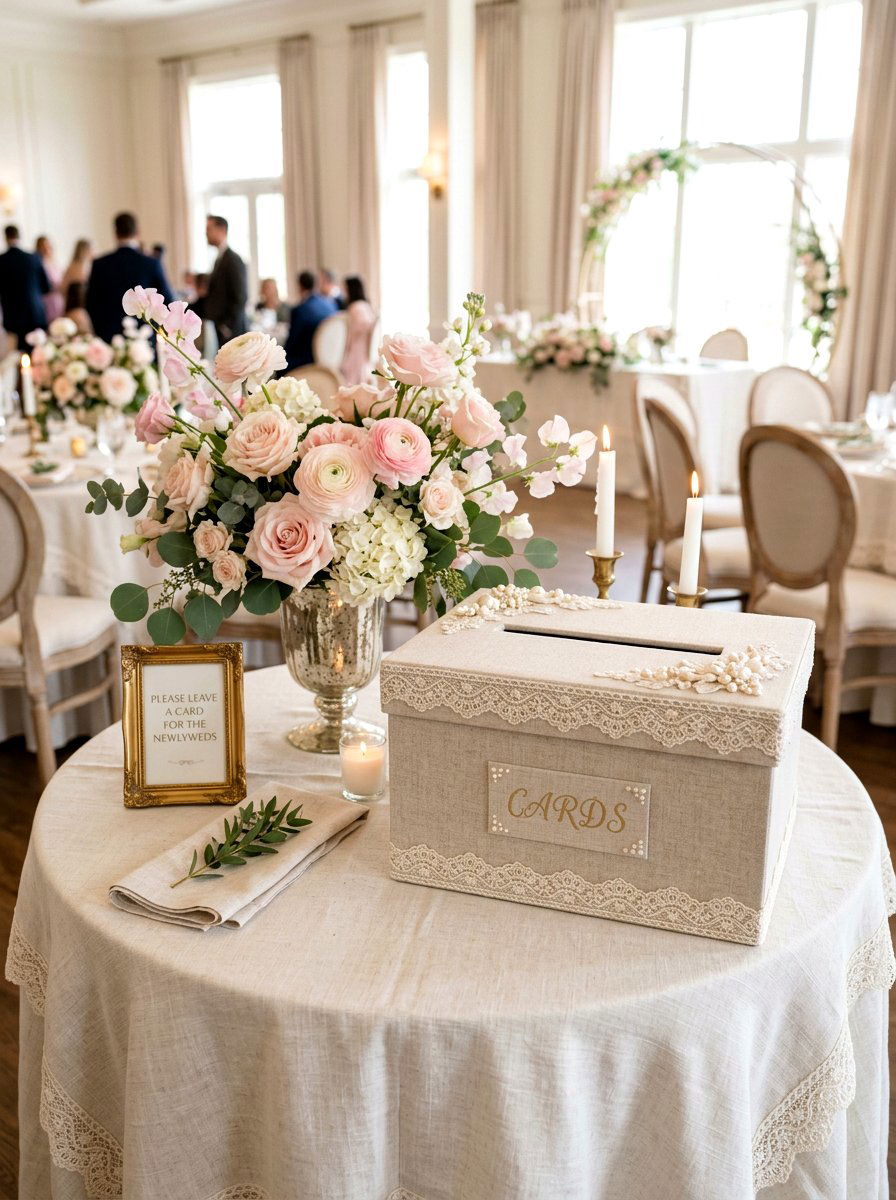
Spring is a season of renewal and fresh beginnings, making it the perfect time to host a gathering for friends and family. When planning your seasonal celebration, the small details often make the biggest impact on the overall guest experience. A beautifully designed menu card serves as both a functional guide and a stunning decorative element for your dining table. It sets the tone for the meal ahead while reflecting the vibrant colors and natural textures of the blooming outdoors. By incorporating thoughtful design elements, you can elevate a simple meal into an elegant occasion that feels curated and special. These cards bridge the gap between your culinary offerings and your carefully planned interior decor for any event.
1. Pressed Flower Menu
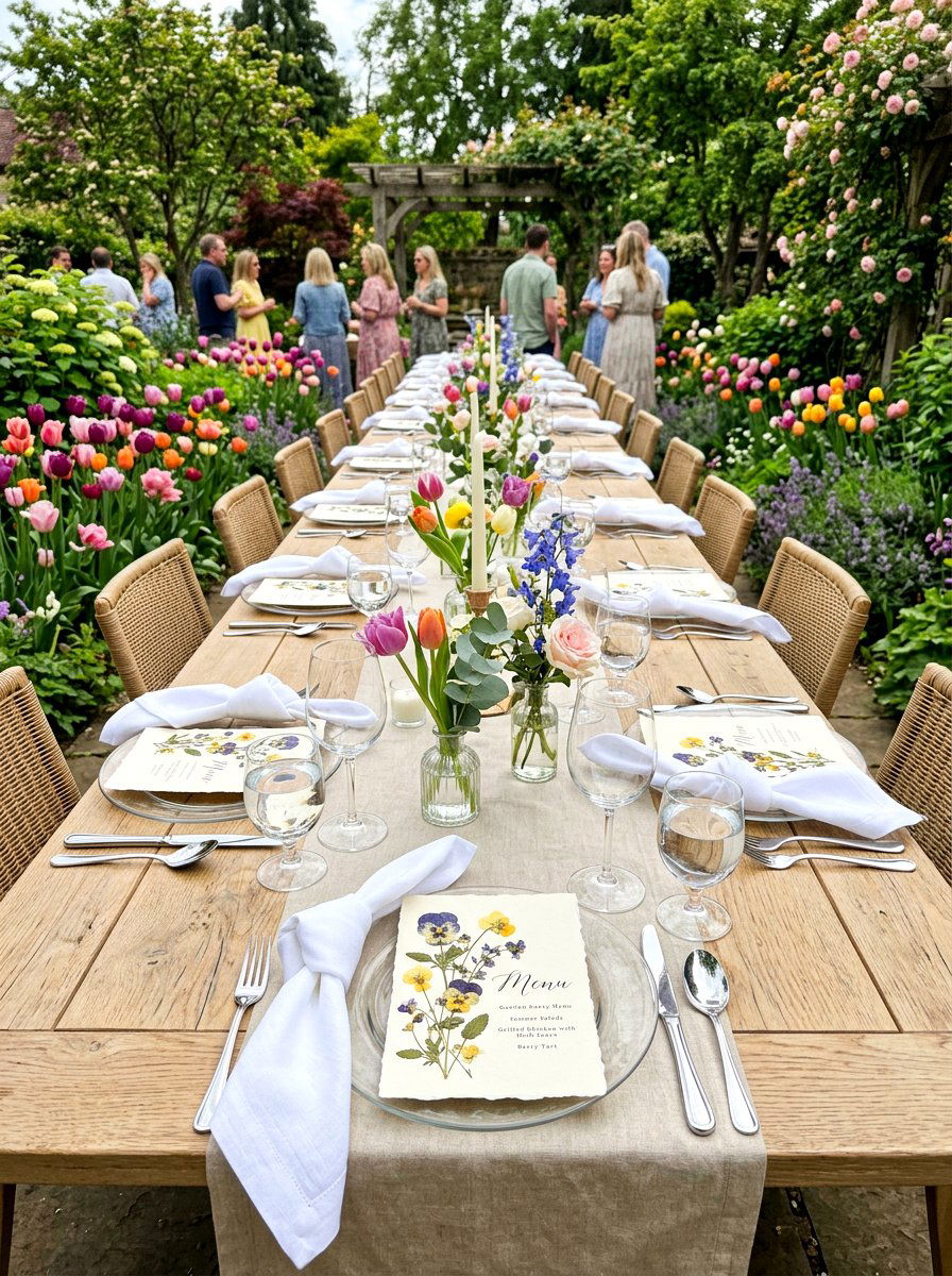
How can you bring the actual beauty of nature directly to your guests' plates this season? A pressed flower menu card uses real, dried blossoms to create a stunning organic focal point for your spring table setting. You can choose vibrant pansies or delicate daisies to press between sheets of heavy paper. This design works exceptionally well for garden parties or outdoor luncheons where the decor reflects the surrounding environment. The texture of the dried petals adds a tactile element that feels personal and handcrafted. When paired with simple linen napkins and glass plates, these cards transform a basic meal into a truly memorable event. They serve as a lovely keepsake that guests will want to take home after the celebration ends.
2. Watercolor Floral Menu
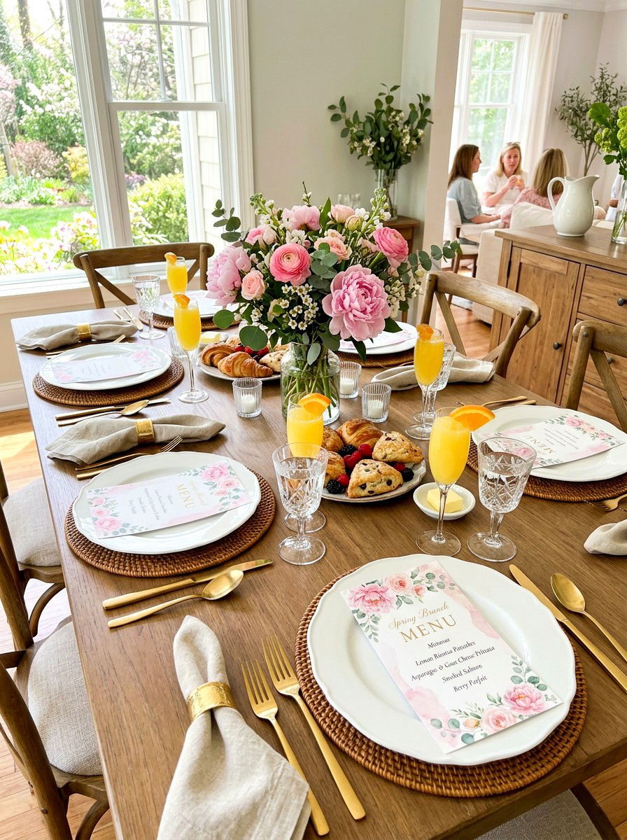
Is there anything that captures the lightness of the spring season better than soft watercolor paints? A watercolor floral menu card brings a sense of artistry and fluidity to your brunch or dinner table. These designs often feature soft washes of pink, lavender, and green, mimicking the appearance of a fresh garden in bloom. Because the edges are often soft and blended, these cards look beautiful when placed atop a crisp white tablecloth. You can opt for a border of painted blossoms or a single large flower in the center to anchor the design. The subtle colors provide a refreshing contrast to vibrant spring salads and seasonal dishes. It is a timeless choice that feels both elegant and approachable for any festive gathering.
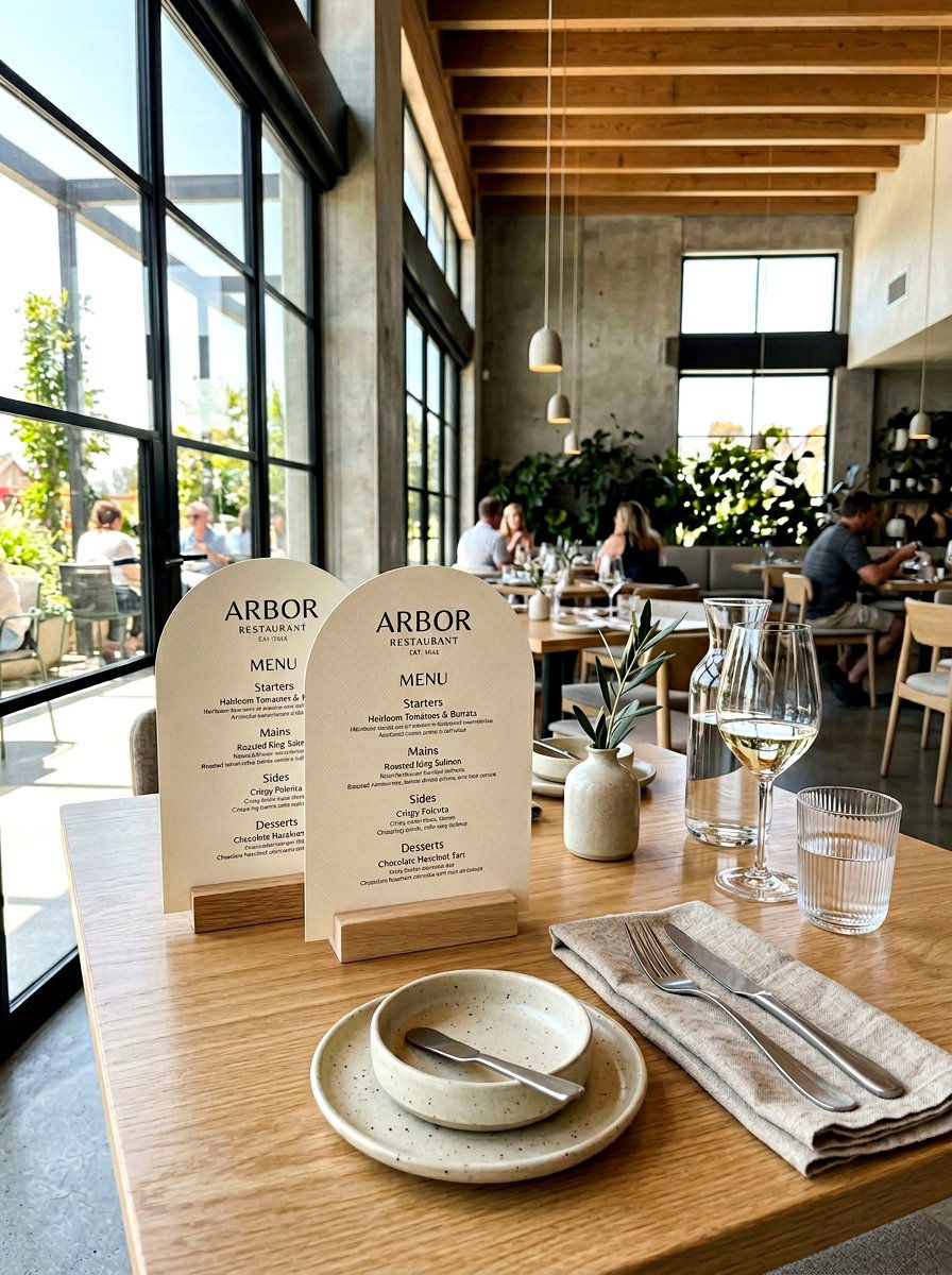
3. Minimalist Typography Menu
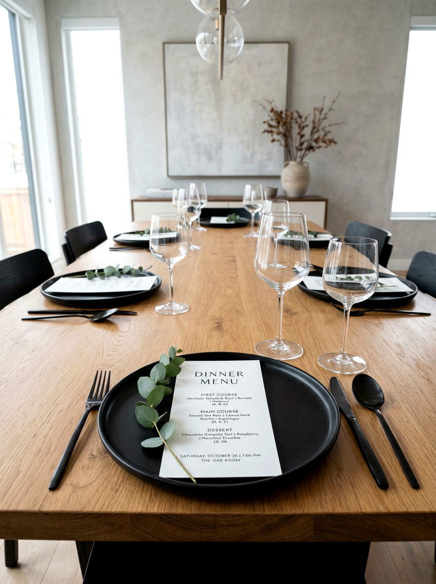
Sometimes the most powerful statement is made through simplicity and clean lines. A minimalist typography menu card focuses on beautiful fonts and plenty of white space to convey a sense of modern sophistication. By choosing a high-quality, heavy-weight cardstock, you allow the texture of the paper to speak for itself. Use a mix of serif and sans-serif fonts to create a visual hierarchy that is easy for guests to read. This style is perfect for a contemporary home interior where the focus is on sleek furniture and uncluttered surfaces. You can add a single small branch or a tiny leaf to the corner for a subtle nod to the spring season. It is a very clean and professional look for any host.
4. Pastel Paper Menu
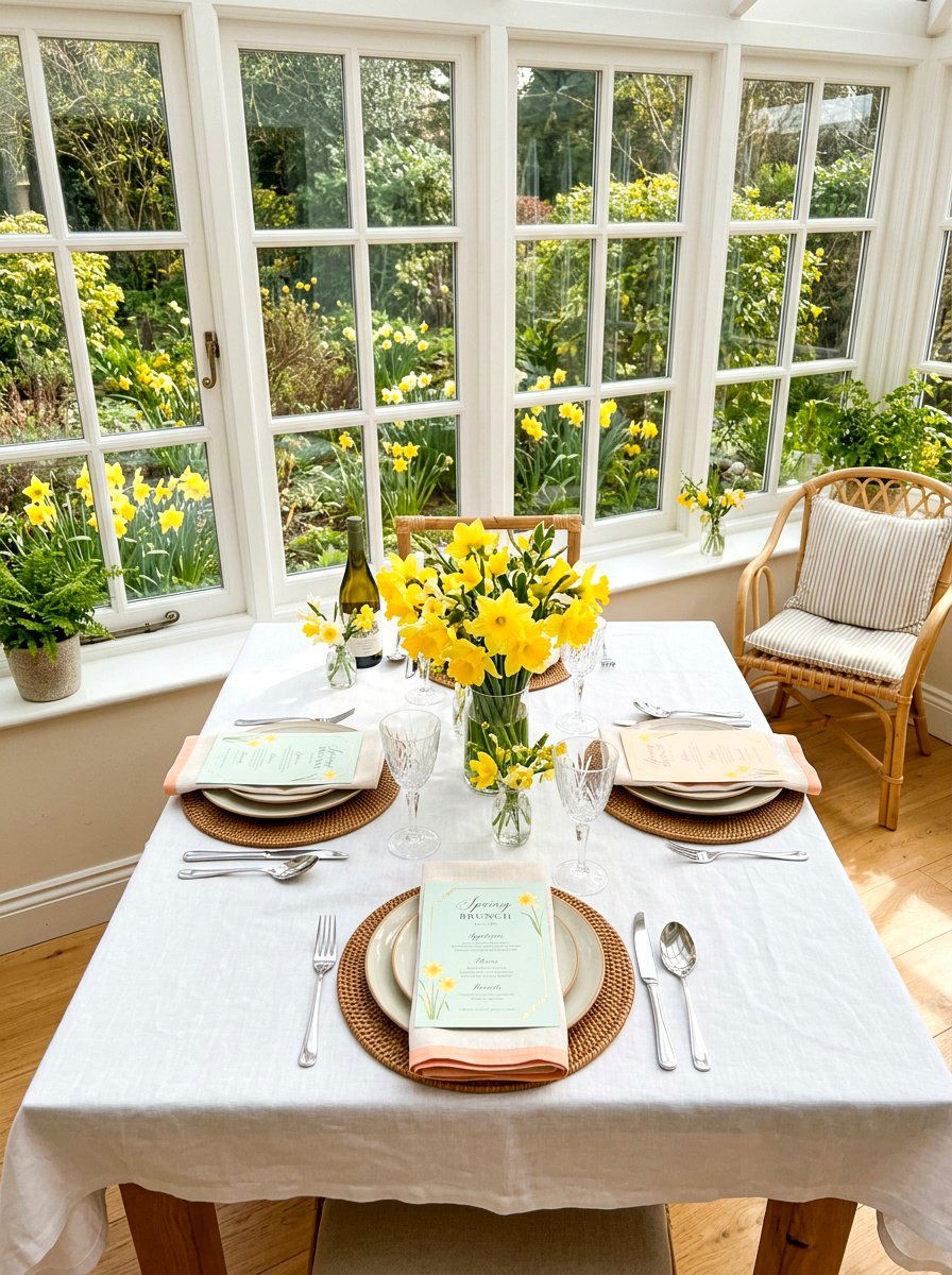
Do you want to infuse your dining area with the soft and cheerful colors of a spring morning? A pastel paper menu card is an easy way to add a pop of color without overwhelming the rest of your table decor. Shades like pale mint, dusty rose, and baby blue work perfectly to create a cohesive seasonal palette. You can print the menu text in a dark charcoal or soft grey to keep the look sophisticated rather than overly bright. These colored cards look fantastic when layered over a white ceramic charger or tucked into a folded napkin. The use of tinted paper provides a solid base that makes the white and green elements of your floral centerpieces stand out even more.
5. Vellum Overlay Menu
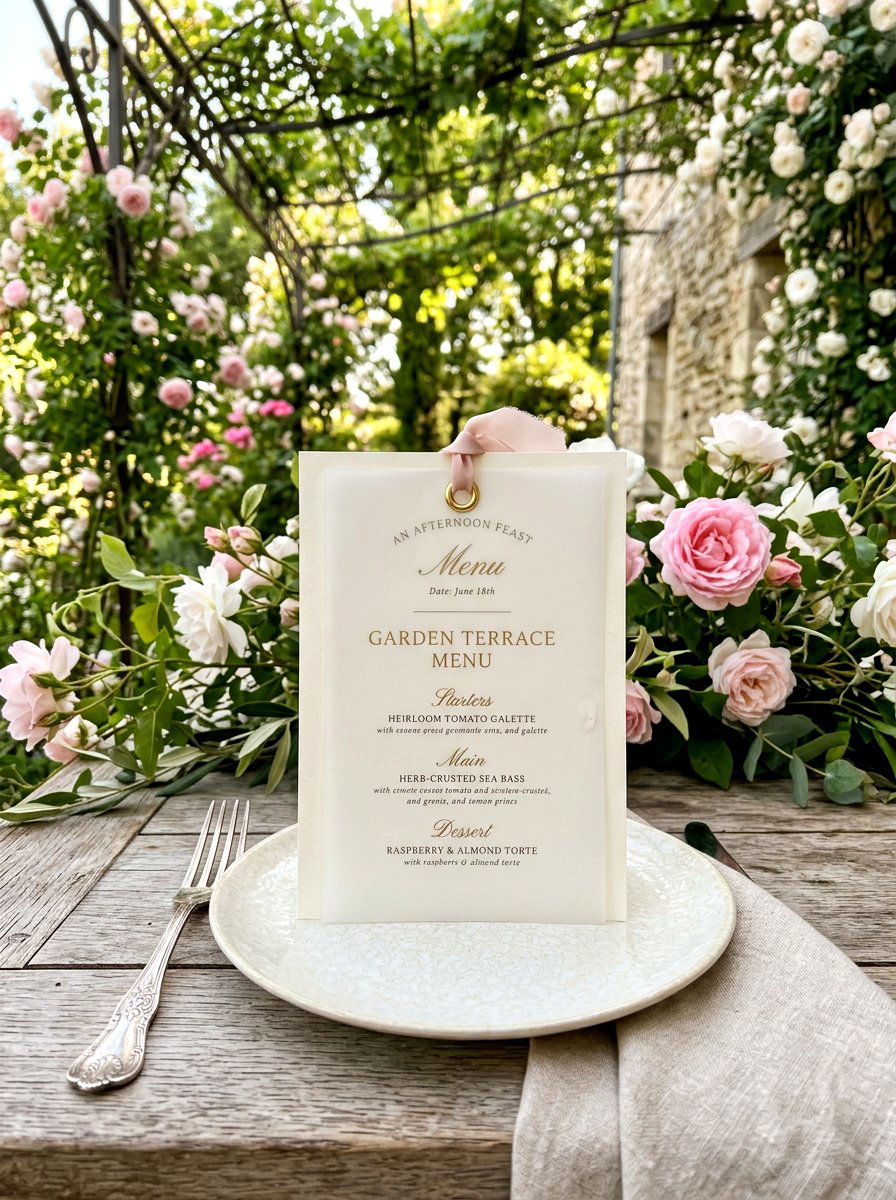
What if you could add a layer of mystery and elegance to your table setting with just one simple material? A vellum overlay menu card features a translucent top layer that sits beautifully over a base of patterned or solid paper. The frosted appearance of the vellum softens the text and any underlying images, creating a dreamy and ethereal effect. You can secure the two layers together with a small brass eyelet or a piece of silk twine for added detail. This design choice is ideal for evening dinner parties where candlelight can play off the semi-transparent surface. It adds a luxurious and multi-dimensional feel to each individual place setting. Guests will appreciate the unique and tactile quality of the layered papers.
6. Deckle Edge Menu
Have you ever noticed how the raw, torn edges of handmade paper can make a design feel much more expensive? A deckle edge menu card embraces imperfections to create a look that is both rustic and incredibly refined. These cards are often made from thick, cotton-based paper that has a soft and fibrous texture. The uneven edges suggest a custom-made quality that pairs beautifully with vintage silverware and antique wooden tables. This style is particularly effective for farmhouse-inspired spring gatherings where natural materials are the star of the show. By keeping the printing simple, you allow the unique shape and texture of the paper to be the main attraction. It feels very authentic and grounded for a relaxed meal.
7. Kraft Paper Menu
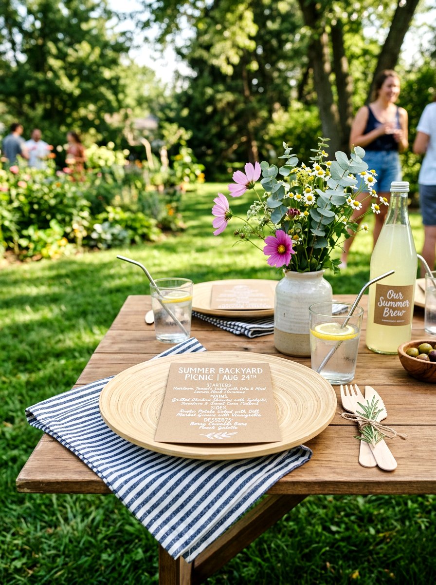
If you are planning a casual outdoor barbecue or a rustic picnic, kraft paper is a fantastic material choice. A kraft paper menu card offers a warm, neutral background that complements the greens and browns of a backyard setting. You can use white ink for the text to create a striking contrast that is both modern and playful. This material is also very durable, making it a practical choice for environments where things might get a bit more lively. Try wrapping the menu card around a set of bamboo utensils or a linen napkin for a neat and organized look. It is an eco-friendly option that feels approachable while still showing your guests that you put thought into every single detail.
8. Acrylic Menu Card
Are you looking for a way to make your spring table feel instantly more modern and high-end? An acrylic menu card provides a sleek, glass-like surface that looks stunning against any backdrop. You can choose clear acrylic for a floating effect or frosted acrylic for a more subtle and soft appearance. The text is typically etched or printed in a crisp white or gold, making it easy to read while maintaining a transparent look. These cards are perfect for bright, sun-lit rooms where the light can pass through the material and create beautiful reflections on the table. They are incredibly durable and serve as a bold statement piece that anchors the entire contemporary design of your dining area.
9. Seed Paper Menu
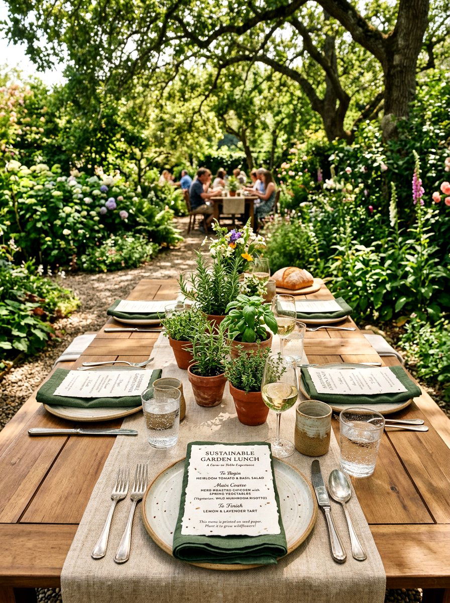
How would you like to give your guests a gift that continues to grow long after your spring party is over? A seed paper menu card is made from recycled materials embedded with wildflower seeds. After the meal, guests can take their menu cards home and plant them in their own gardens. This sustainable choice perfectly aligns with the themes of growth and nature that define the spring season. The paper usually has a slightly bumpy and organic texture that looks wonderful with simple, earth-toned printing. It is a conversation starter that demonstrates your commitment to the environment while providing a beautiful and interactive element to your table. Your guests will truly love this unique and thoughtful gesture.
10. Gold Foil Menu
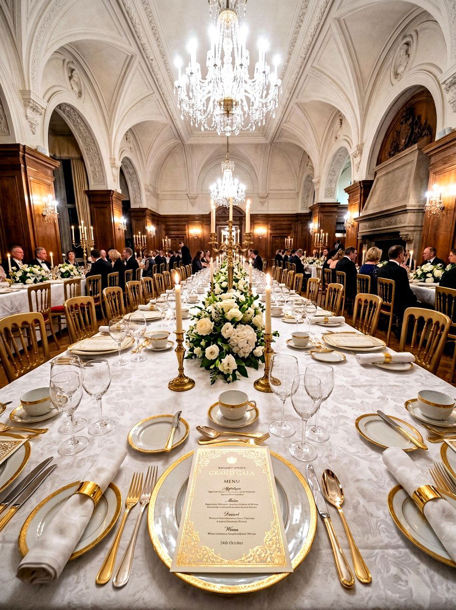
If you want to add a touch of glamour and shine to your spring table, gold foil is the way to go. A gold foil menu card features metallic accents that catch the light and create a sense of celebration. You can use the foil for the headers, the border, or even small decorative icons like butterflies or flowers. This look is especially effective when paired with gold-rimmed glassware and polished brass candlesticks. The warmth of the gold complements the soft pastels of spring, adding a layer of richness to the palette. It is a sophisticated choice for a formal luncheon or a milestone birthday celebration. The shimmering details make each guest feel like they are attending a truly special and upscale event.
11. Ribbon Tied Menu
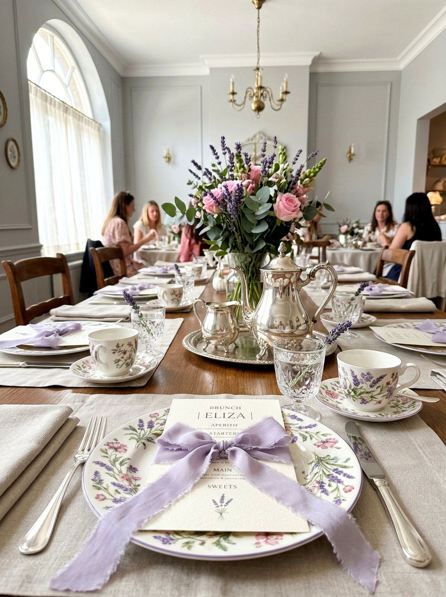
Sometimes a small piece of fabric is all you need to tie your entire table design together perfectly. A ribbon tied menu card uses a thin strand of silk or velvet to attach the menu to a napkin or a sprig of greenery. You can choose a ribbon color that matches your floral arrangements to create a cohesive and professional look. The soft texture of the ribbon adds a feminine and romantic touch that is ideal for a spring bridal shower or brunch. Allowing the ends of the ribbon to trail slightly off the plate adds movement and grace to the table setting. It is a simple yet effective way to add a layer of color and texture to each individual place.
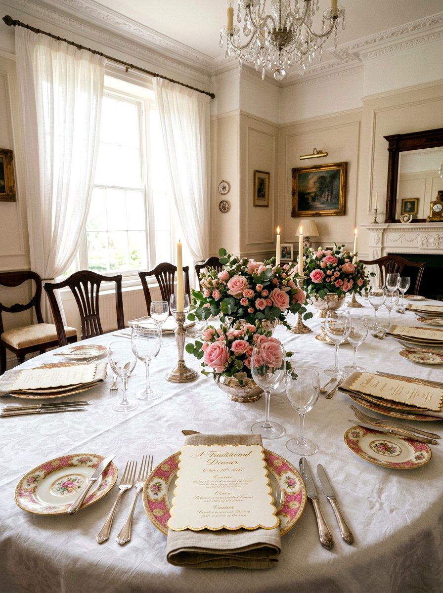
12. Wax Seal Menu
Does the idea of an old-world, handcrafted detail appeal to your sense of style and tradition? A wax seal menu card features a custom or decorative stamp that secures a ribbon or simply adds a focal point to the top of the card. You can find wax in a variety of spring shades, such as sage green, lavender, or even a soft pearlescent white. The raised texture of the seal adds a sense of importance and luxury to the menu. This detail works beautifully with classic stationery and elegant table settings featuring fine china. It tells your guests that this meal is an occasion worth documenting and celebrating with a high level of care and artistic flair.
13. Hand Lettered Menu
There is something incredibly charming and personal about seeing a host's own handwriting or professional calligraphy on the table. A hand lettered menu card feels intimate and bespoke, making each guest feel specifically chosen for the gathering. You can use a brush pen for a more modern, casual look or a traditional nib and ink for something formal. This style is perfect for smaller, more intimate spring gatherings where you want the atmosphere to feel cozy and connected. The slight variations in the lettering add a human touch that computer fonts simply cannot replicate. Pairing this with a simple piece of cardstock ensures that the focus remains entirely on the beautiful and fluid movement of the handwritten text.
14. Botanical Sketch Menu
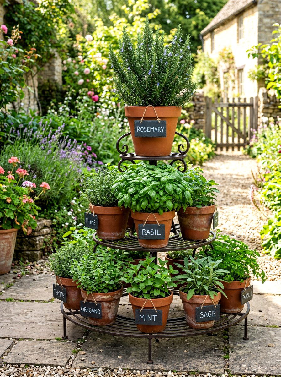
If you love the look of old science illustrations, a botanical sketch menu card might be the perfect choice for you. These designs feature detailed line drawings of herbs, flowers, or garden vegetables in a vintage style. Using black ink on a cream-colored or off-white paper gives the cards a classic and scholarly feel. This design is particularly fitting for a farm-to-table spring dinner where the ingredients are the main focus of the conversation. You can feature the specific herbs used in the dishes, such as rosemary or thyme, as the illustrations. It is an educational and visually interesting way to bridge the gap between the garden and the dining table for your guests.
15. Die Cut Menu
Why settle for a standard rectangular card when you can experiment with unique and interesting shapes? A die cut menu card is professionally cut into a specific silhouette, such as a leaf, a flower, or even a classic circle. This unconventional shape immediately draws the eye and makes the table setting feel more dynamic and playful. It is a great way to break up the straight lines of a typical dining table and add a bit of whimsy to the decor. These cards look especially good when placed directly on top of a contrasting colored plate. The unique border creates a frame for the text that feels deliberate and high-designed. It is a creative way to express your seasonal theme.
16. Arched Shape Menu
One of the biggest trends in modern stationery is the move toward soft, architectural curves. An arched shape menu card features a rounded top that mimics the look of a classic window or a garden gate. This shape feels very intentional and sophisticated, providing a softer alternative to sharp corners. It is a versatile choice that works well with both minimalist designs and more elaborate floral patterns. You can stand these cards upright using a small wooden or acrylic holder to add height to your table setting. The arched silhouette provides a beautiful frame for the menu items and looks particularly elegant when printed on a thick, matte paper. It is a subtle way to incorporate a very trendy design element.
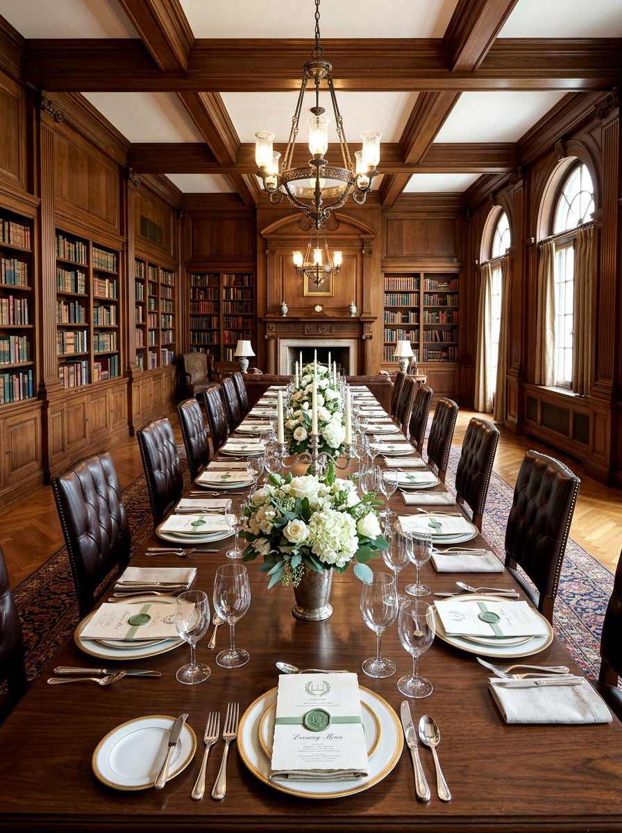
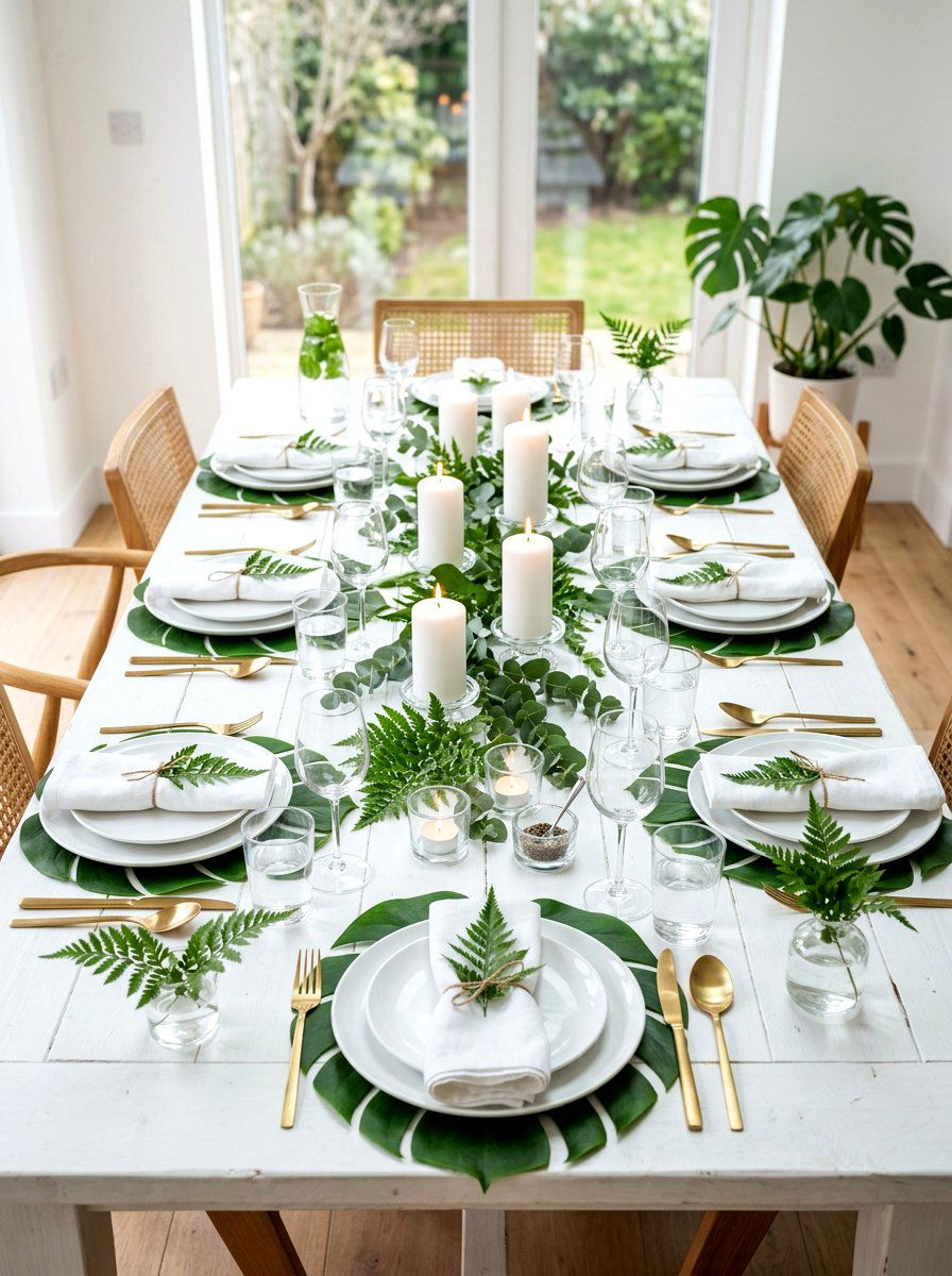
17. Linen Paper Menu
Texture plays a massive role in how we perceive the quality of a dining experience and the overall atmosphere. A linen paper menu card has a subtle cross-hatch texture that mimics the look and feel of high-end fabric. This material is incredibly elegant and feels wonderful to the touch when guests pick it up to read the meal options. It is a durable choice that holds ink beautifully, ensuring that even the finest details of your design are crisp and clear. This paper works well for formal spring events where you want every element to feel substantial and luxurious. The natural, fabric-like finish complements linen napkins and woven placemats, creating a very cohesive and tactile experience for everyone at the table.
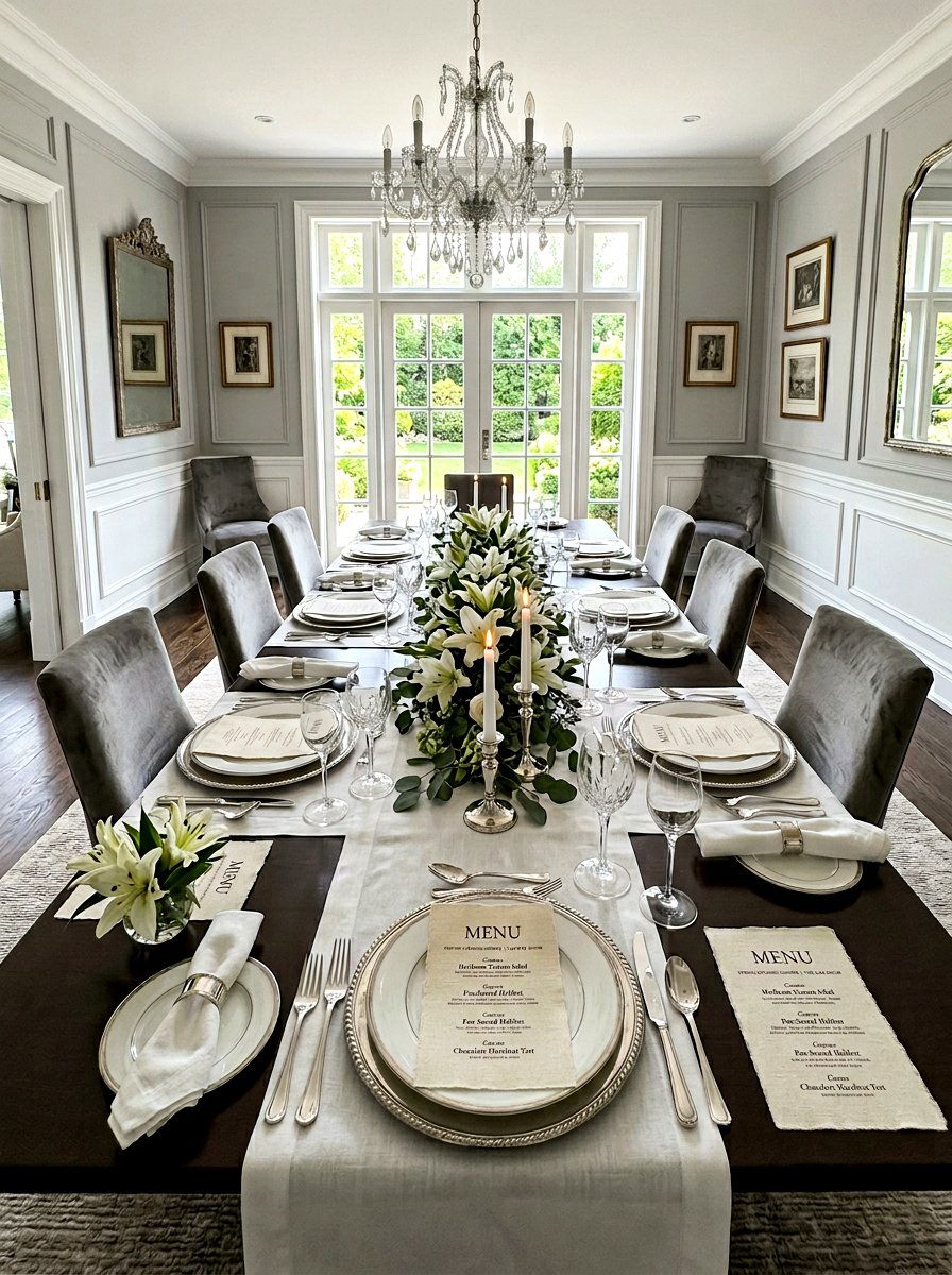
18. Monogrammed Menu
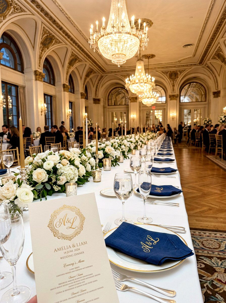
Adding a personal touch to your table setting can make your guests feel like they are part of something truly exclusive. A monogrammed menu card features your initials or the initials of the guest of honor at the very top. You can use an elegant script or a bold, modern block letter depending on the overall style of your event. This design choice is perfect for weddings, anniversaries, or special family brunches during the spring season. The monogram creates a sense of branding for the event, making everything feel curated and professionally planned. It is a timeless design element that never goes out of style and adds an immediate sense of prestige to the dining area.
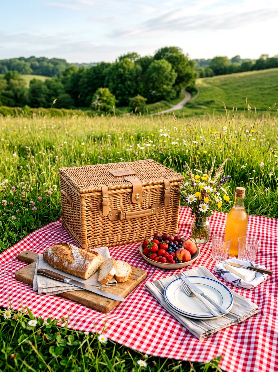
19. Garden Party Menu
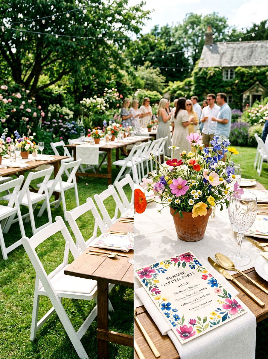
When the weather is beautiful, there is nothing quite like moving the party outside to enjoy the fresh air. A garden party menu card should reflect the lush greenery and bright blooms of the outdoors. You can use a full-bleed floral pattern that covers the entire back of the card, with the menu text on a clean white front. Bright greens, yellows, and oranges can be used to mirror the energy of a sun-drenched garden. This style is all about joy and abundance, so do not be afraid to use bold patterns and vibrant colors. It sets a cheerful tone for a relaxed afternoon spent with friends among the flowers and trees of your home.
20. Herb Bundle Menu
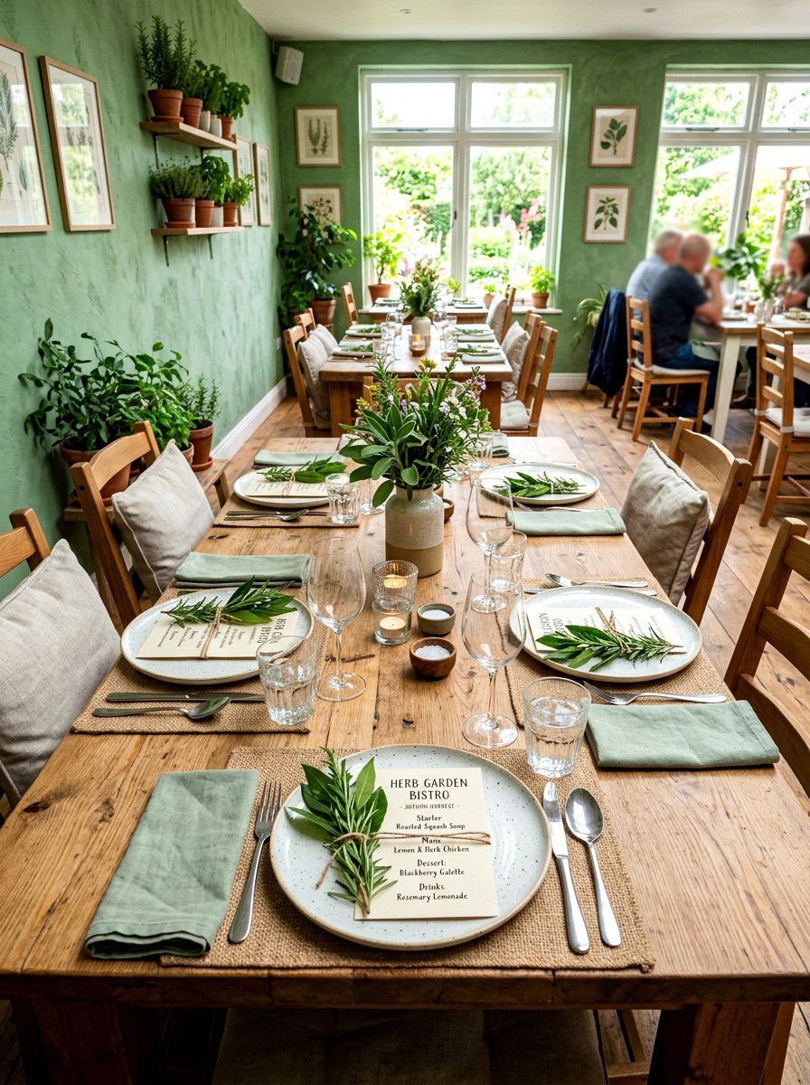
Are you looking for a way to engage your guests' sense of smell as soon as they sit down to eat? An herb bundle menu card is attached to a small bunch of fresh herbs like rosemary, lavender, or mint using a piece of twine. As guests move their menus to begin the meal, the scent of the fresh herbs is released into the air. This creates a multi-sensory experience that is perfectly suited for the fresh flavors of spring cuisine. The green of the herbs provides a beautiful natural accent against a simple white or cream menu card. It is a low-cost but high-impact way to bring a piece of the garden directly to the dinner table.
21. Tassel Menu Card
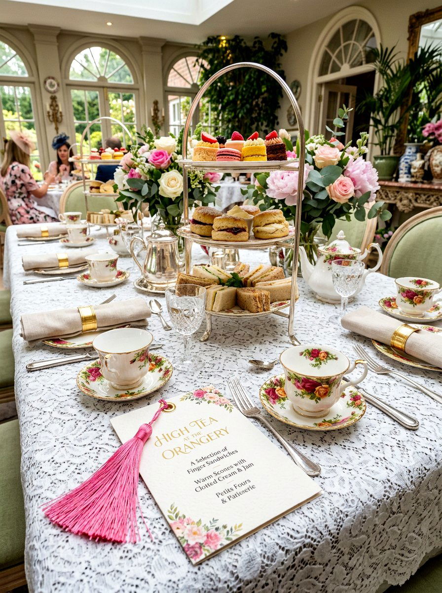
For those who love a bit of flair and movement, adding a tassel can transform a simple card into something special. A tassel menu card features a small silk or cotton tassel hanging from a punched hole at the top or side. You can match the tassel color to your napkins or floral centerpieces to create a very intentional look. The way the tassel drapes over the edge of the plate adds a layer of sophistication and playfulness to the setting. This detail is particularly popular for upscale spring luncheons or elegant tea parties. It gives the menu a finished, decorative quality that makes it feel more like a piece of art than just a list of food.
22. Geometric Menu Card
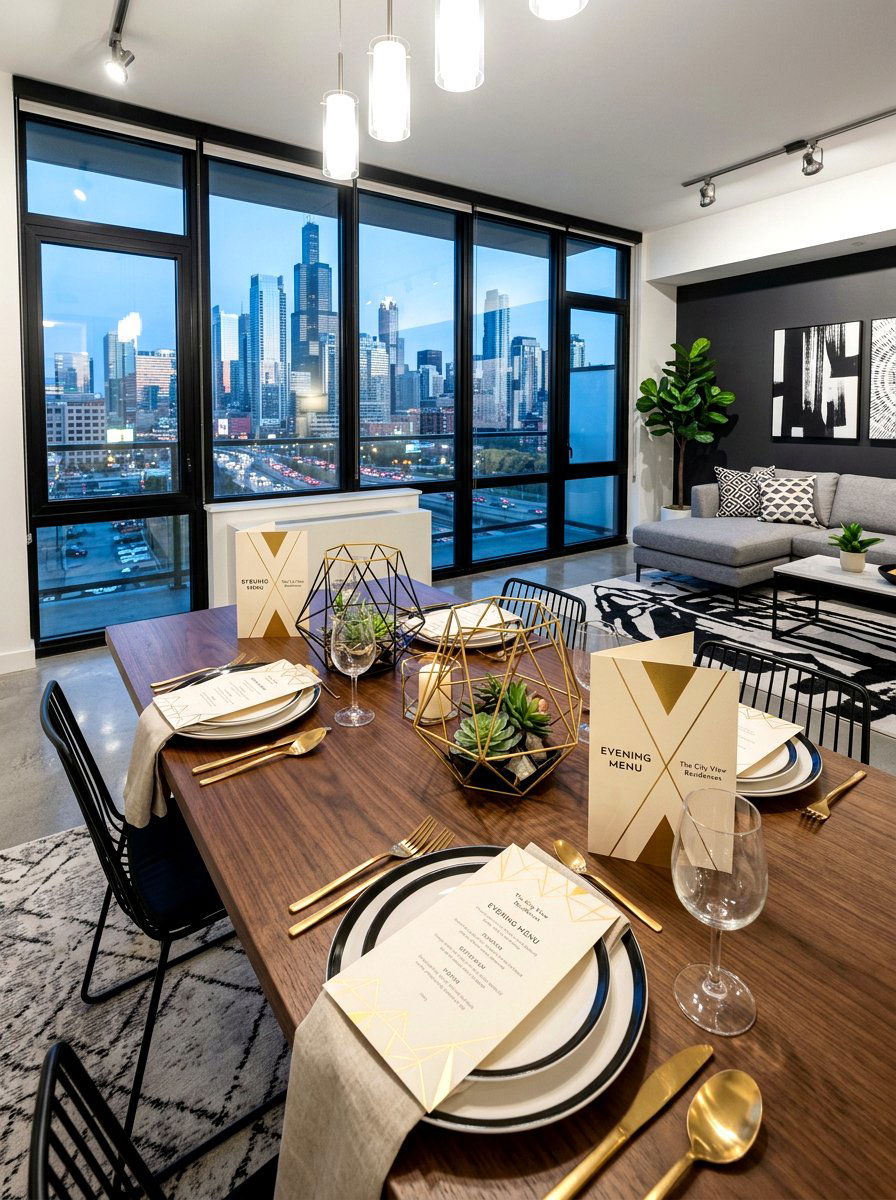
If your home features a lot of modern art and clean lines, a geometric menu card might be the ideal fit. This design uses sharp angles, triangles, or hexagons to create a structured and contemporary look. You can use gold or silver lines to define the shapes and give the card a bit of a metallic edge. This style works well for evening parties where you want a more urban or architectural feel. By using a limited color palette, you keep the focus on the interesting shapes and the layout of the text. It is a great way to show off your modern aesthetic while still acknowledging the fresh and light spirit of the spring season.
23. Butterfly Motif Menu
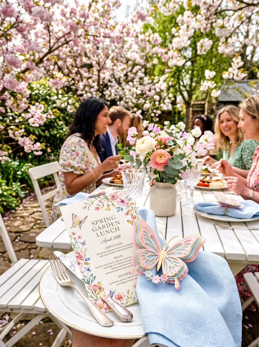
Spring is the time when butterflies begin to reappear, making them a perfect symbol for your seasonal stationery. A butterfly motif menu card can feature a delicate illustration or even a small 3D paper butterfly attached to the corner. This adds a sense of whimsy and wonder to your table setting that guests of all ages will appreciate. You can keep it subtle with a single embossed butterfly or go bold with a colorful watercolor version. This theme is especially lovely for baby showers or children's birthday parties held in the spring. It evokes a sense of lightheartedness and beauty that perfectly matches the feeling of a garden in full bloom during the warmer months.
24. Scalloped Edge Menu
Sometimes a small change to the border of a card can completely change its personality and visual appeal. A scalloped edge menu card features a wavy, cloud-like border that feels very traditional and charming. This detail adds a soft, feminine touch to the table that pairs beautifully with floral patterns and pastel colors. It is a great way to make a simple white card feel more decorative and intentional without adding a lot of extra color. The scalloped edge looks particularly good when layered over a circular plate, as the curves complement each other. It is a classic design choice that brings a sense of nostalgia and sweetness to your spring celebration and dining room.
25. Wood Veneer Menu
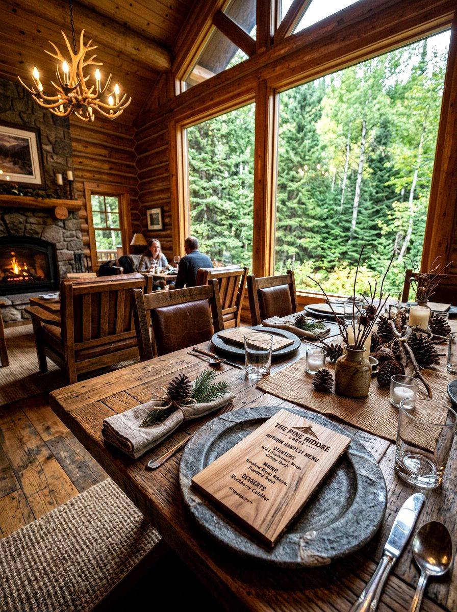
If you want a truly unique and organic look, consider using a non-traditional material like real wood. A wood veneer menu card is made from a very thin slice of wood that is flexible enough to be printed on. The natural grain of the wood provides a beautiful and one-of-a-kind background for your menu text. This choice is perfect for a rustic, eco-conscious spring event where you want to emphasize natural beauty and sustainability. The warmth of the wood looks stunning against white linens and green foliage. It is a durable and memorable card that guests will likely want to keep as a souvenir. It brings a grounded and earthy element to any high-end or casual table.
Conclusion:
Selecting the right menu card for your spring event is a wonderful way to showcase your personal style and creativity. Whether you prefer the rustic charm of kraft paper or the modern elegance of gold foil, each design choice helps tell the story of your celebration. These small pieces of stationery act as the finishing touch that brings your entire table setting together into a cohesive and beautiful display. As you plan your next gathering, consider how these elements can enhance the atmosphere and make your guests feel truly welcomed. Spring is all about celebrating life and growth, and a well-crafted menu is the perfect way to honor that spirit. Your attention to detail will surely leave a lasting impression on everyone who sits at your table.
Related posts:
Leave a Reply