
Spring brings a sense of renewal that we often want to mirror inside our homes through color. Using pastel palettes is a classic way to invite freshness and light into any living space without overwhelming the senses. These soft hues provide a subtle splash of personality while maintaining a calm, airy atmosphere that feels both modern and timeless. Whether you are looking to refresh a small powder room or completely overhaul a master suite, pastel tones offer endless versatility for every design style. Let’s explore various ways to incorporate these light-filled shades into your home decor to create a welcoming, seasonal sanctuary that feels bright and cheerful.
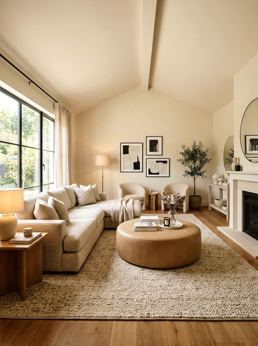
1. Sage green living room
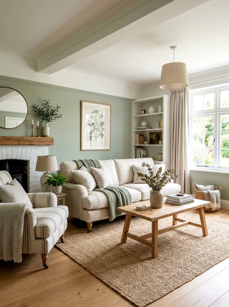
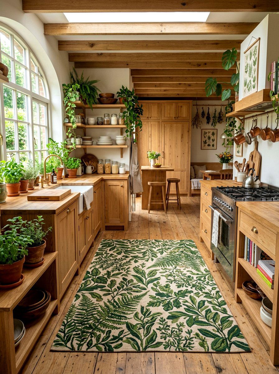
Have you ever walked into a room and immediately felt a sense of peace? A sage green living room achieves this by bringing the calming essence of nature indoors during the spring season. This soft, earthy pastel works beautifully on main walls, providing a sophisticated backdrop for neutral furniture like a cream-colored linen sofa. You can enhance the organic feel by adding light wood accents and plenty of indoor potted plants. This color palette is incredibly versatile, allowing you to layer different textures like woven rugs and cotton throws. It creates a space that feels grounded yet refreshed, perfect for relaxing after a long day of work or hosting family.
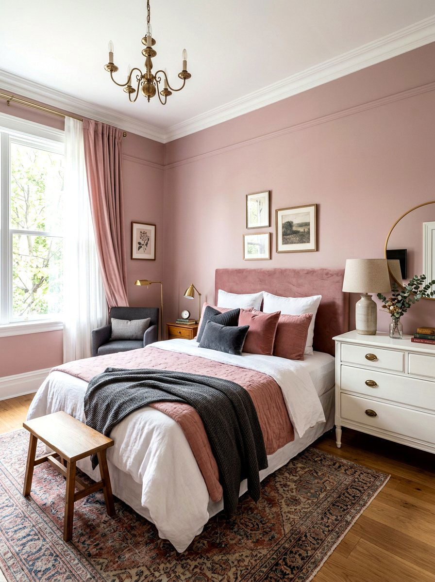
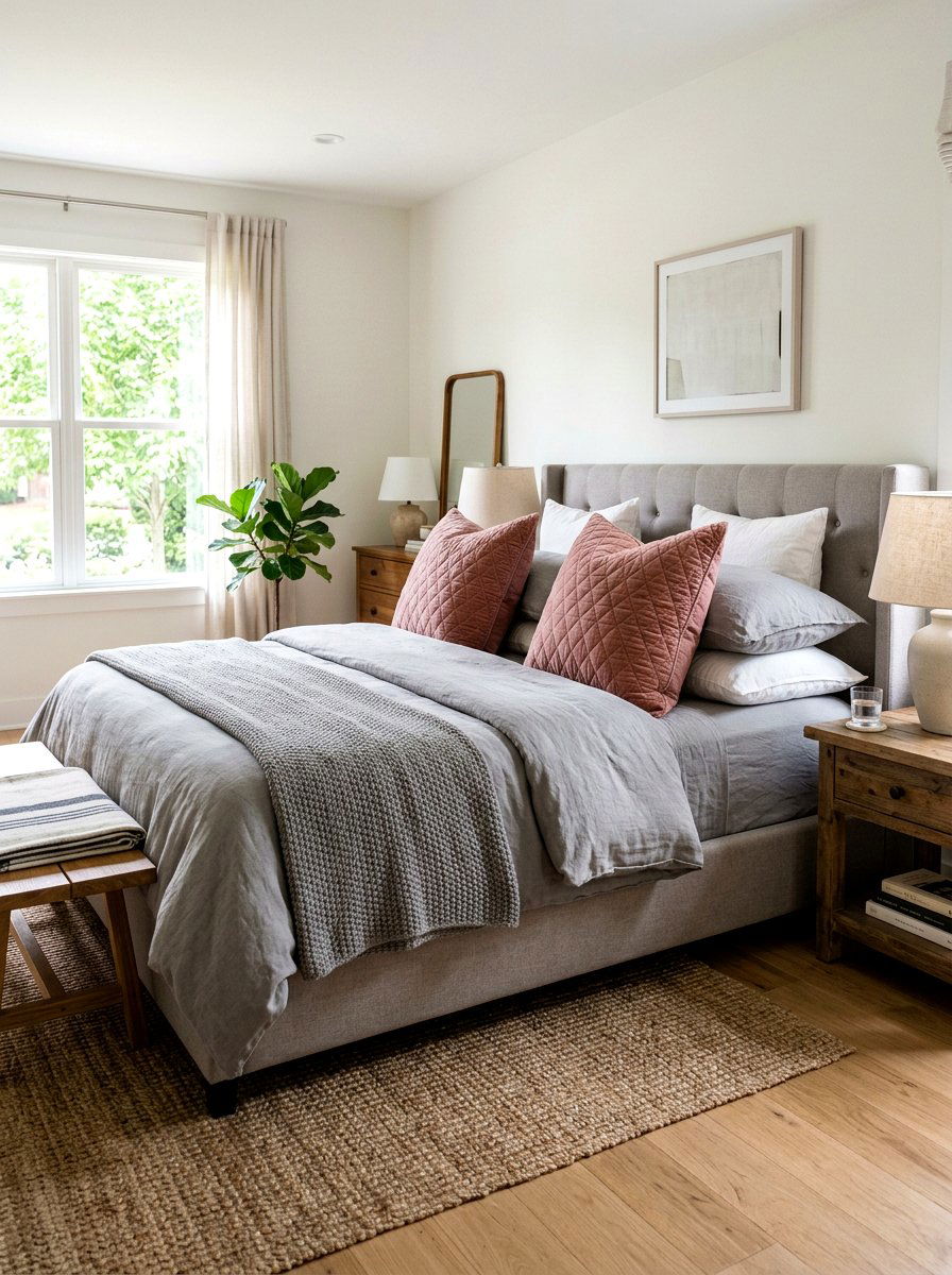
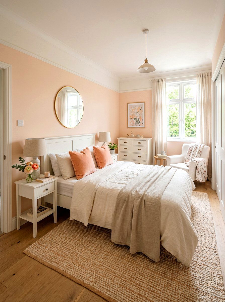
2. Blush pink bedroom
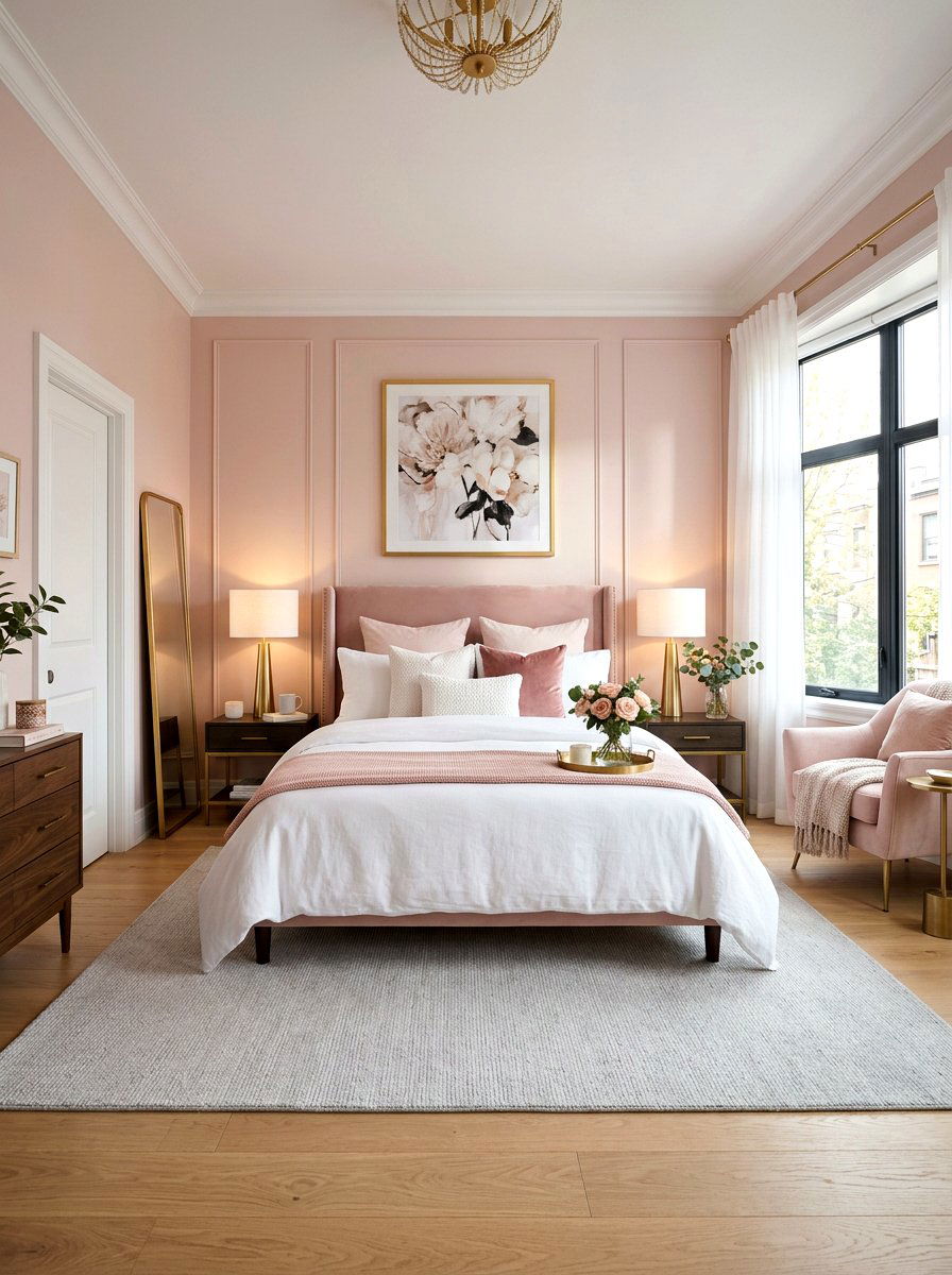
Is there anything more romantic and soothing than a bedroom dipped in soft blush tones? A blush pink bedroom offers a delicate and warm atmosphere that feels incredibly inviting when the morning sun hits the walls. Instead of feeling overly sugary, this shade acts as a sophisticated neutral when paired with crisp white bedding and light grey accents. You might consider adding metallic touches like gold or brass lamps to elevate the overall look. This palette works wonders in smaller rooms because it reflects light so well, making the space feel larger and more open. It is the perfect choice for creating a cozy, serene retreat within your home.
3. Mint green kitchen
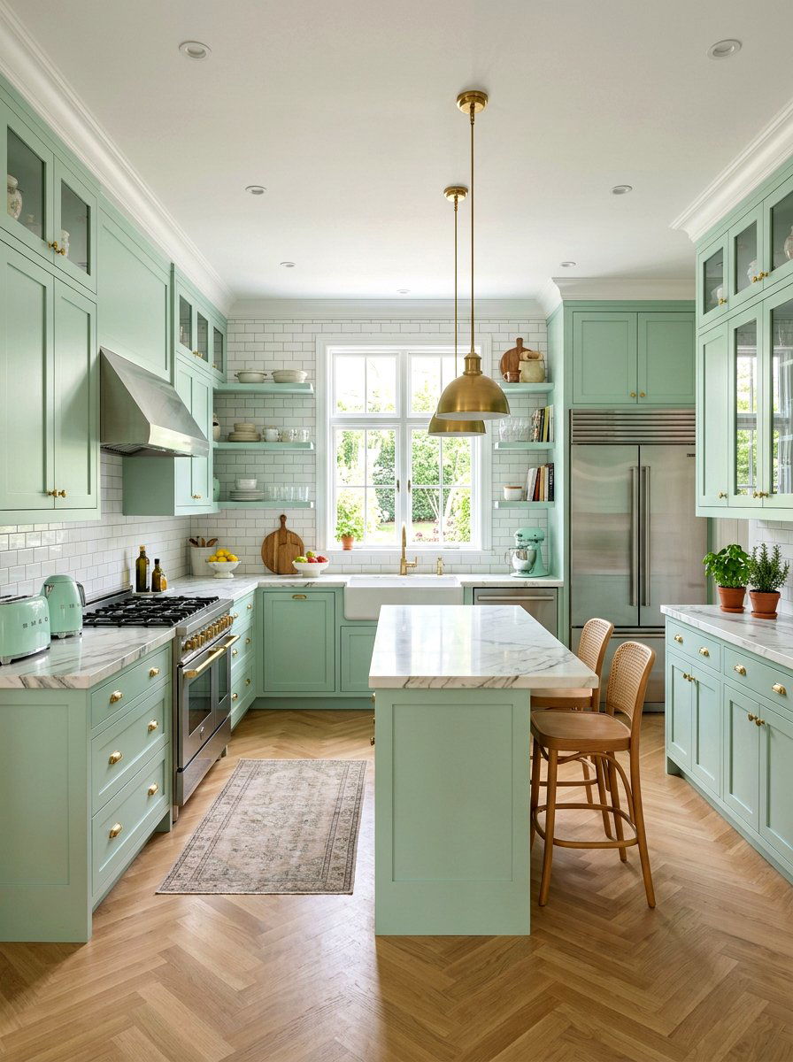
Does your kitchen feel a bit tired and in need of a seasonal update? A mint green kitchen is a fantastic way to inject energy and a vintage-inspired charm into the heart of your home. Painting the cabinets in a soft mint green instantly brightens the room and pairs beautifully with white subway tiles and marble countertops. This cool-toned pastel feels clean and crisp, which is exactly what most people want in a cooking space. You can finish the look with polished nickel hardware and some light-colored wooden bar stools. It creates a cheerful environment that makes preparing morning coffee or family meals feel like a joyful experience.
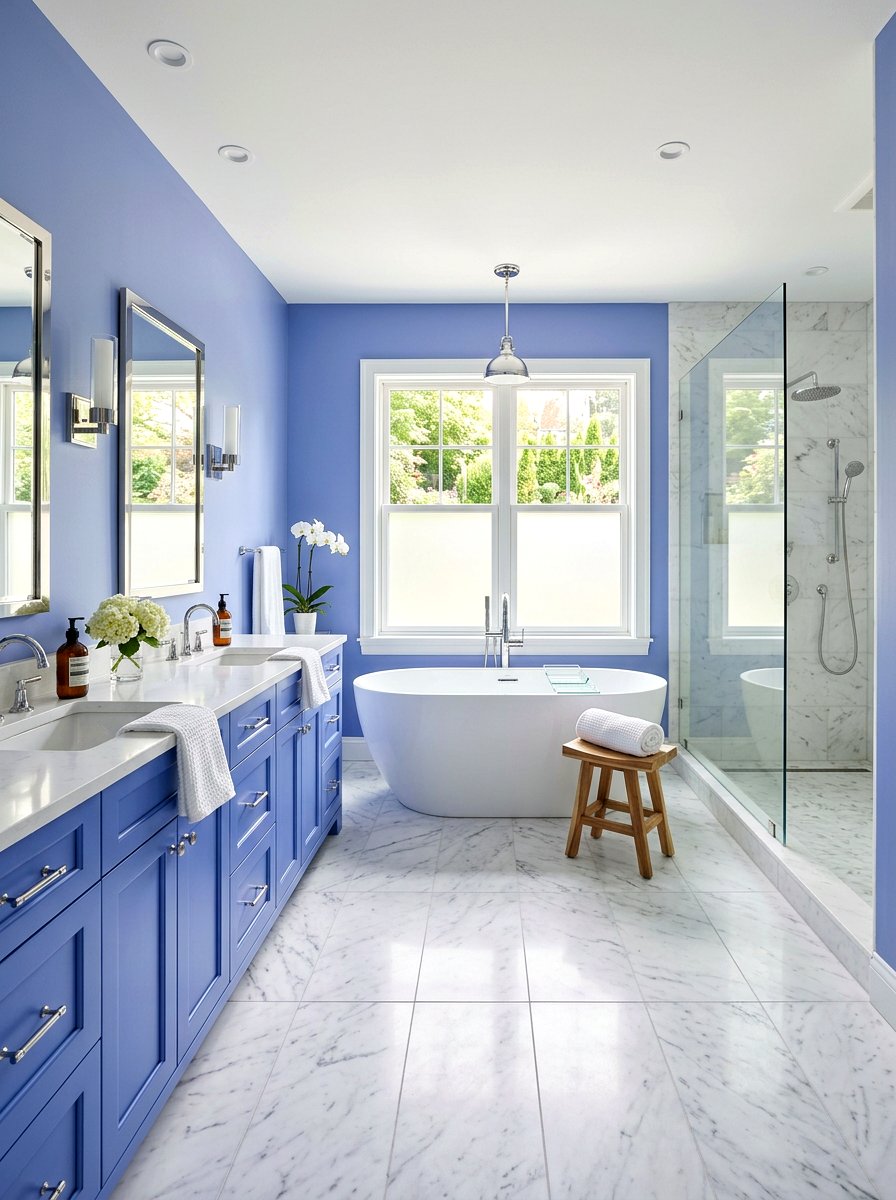
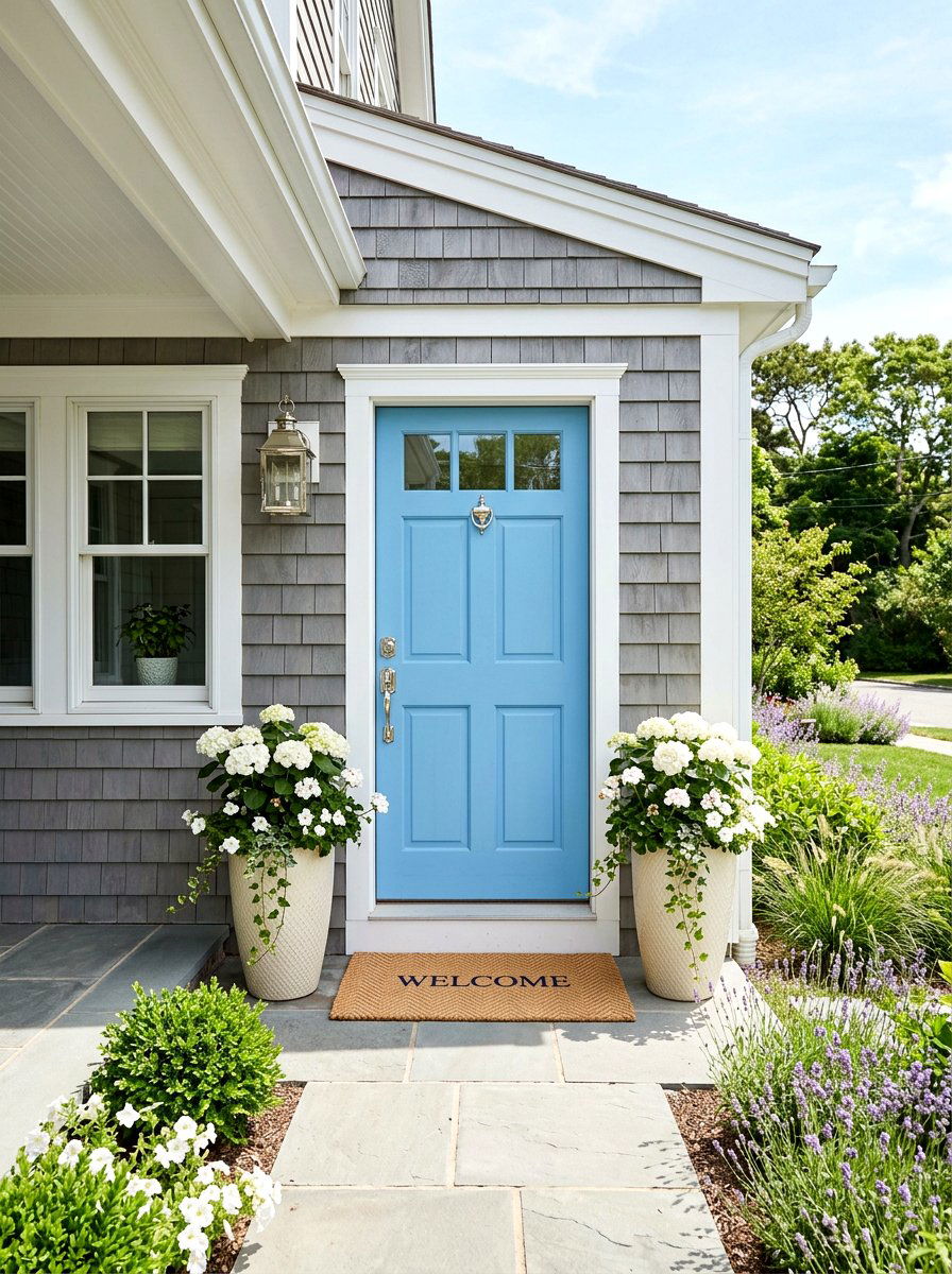
4. Sky blue bathroom
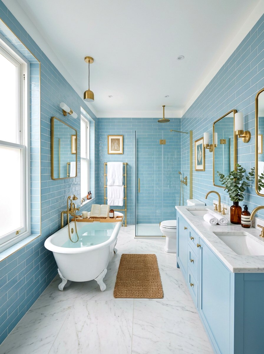
Imagine stepping into a bathroom that feels as vast and clear as a bright spring morning sky. A sky blue bathroom creates a spa-like environment that promotes relaxation and cleanliness through its airy and light qualities. This shade works exceptionally well on tiled walls or as a vanity color against a backdrop of white wainscoting. To keep the look modern, you should use matte black or brushed gold fixtures to provide a bit of contrast. Adding fluffy white towels and a simple glass shower enclosure helps maintain the open feel. This palette is a timeless choice for anyone wanting to create a refreshing and calm personal sanctuary.
5. Lavender dining room
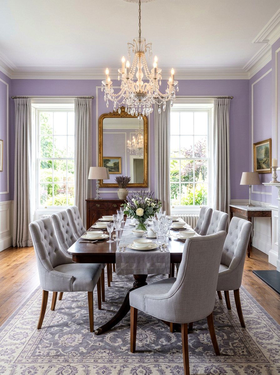
Can a dining space feel both elegant and whimsical at the exact same time? A lavender dining room proves that it certainly can by offering a unique and sophisticated twist on traditional spring colors. This soft purple hue creates a beautiful backdrop for a dark wood dining table or a modern glass set. You can lean into the floral inspiration by adding a centerpiece of fresh lilacs or dried lavender sprigs. Using light grey upholstered chairs helps to ground the color so it doesn't feel too intense for the space. It is a wonderful choice for those who love to entertain and want a conversation-starting room that feels elevated.
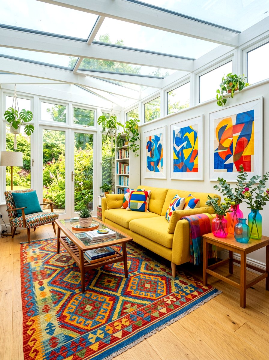
6. Butter yellow sunroom
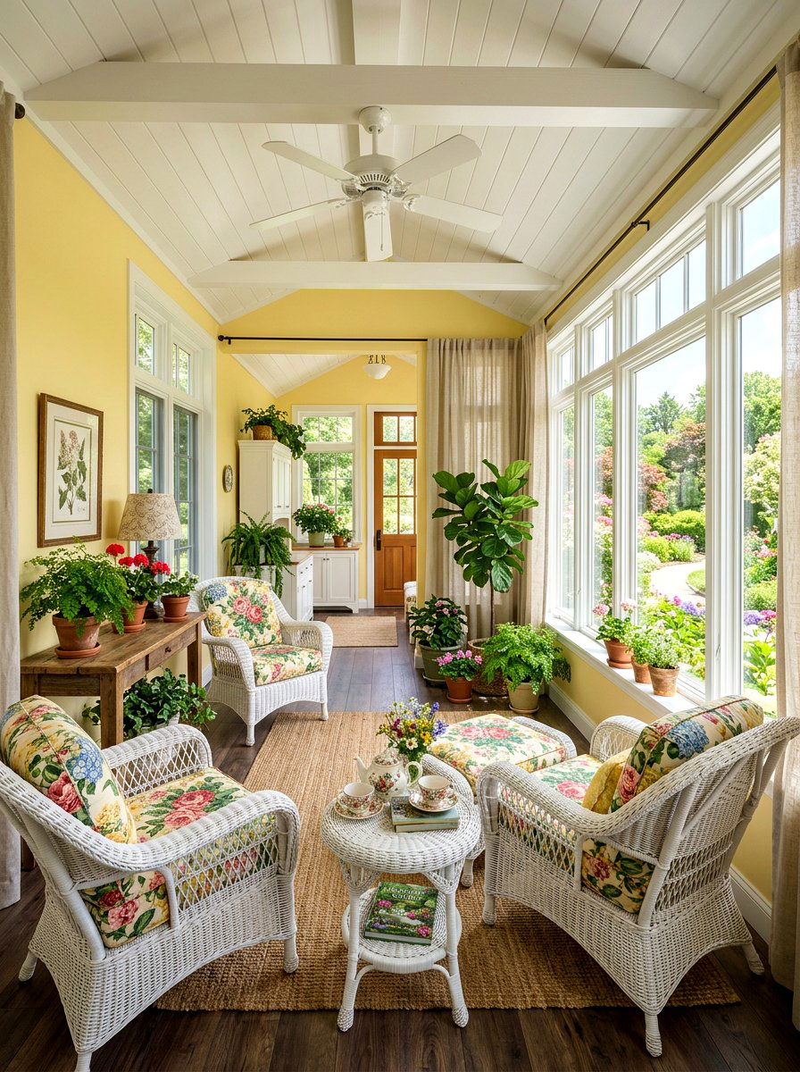
Are you looking for a way to capture the essence of sunshine even on a cloudy day? A butter yellow sunroom is the ultimate solution for creating a bright and happy space that feels warm and welcoming year-round. This soft, creamy pastel mimics the glow of the sun and looks incredible when paired with white wicker furniture and floral print cushions. You can add large windows to let in natural light, which further enhances the vibrancy of the yellow walls. This room becomes the perfect spot for reading a book or enjoying a light brunch. It feels like a constant embrace of spring every time you walk inside.
7. Peach nursery
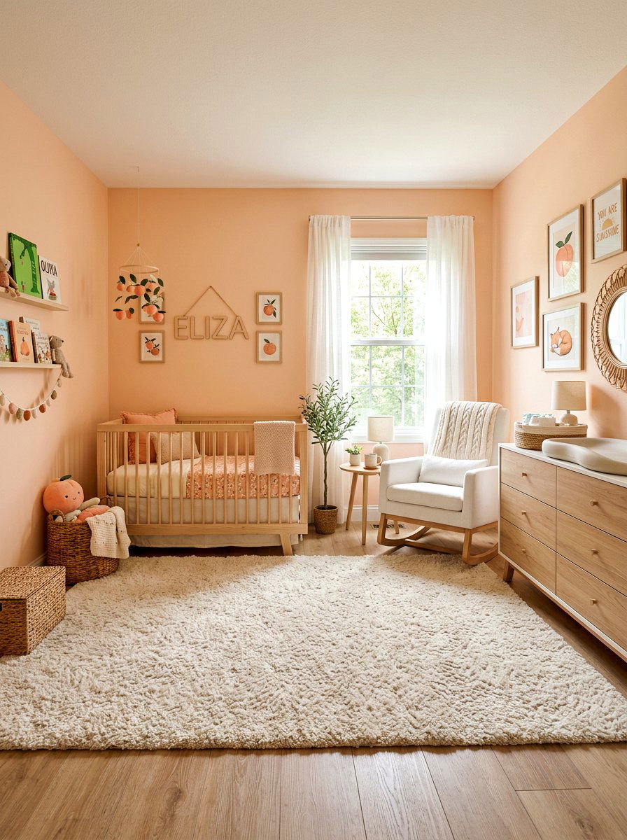
Setting up a room for a new arrival is an exciting task that deserves a gentle and comforting color palette. A peach nursery offers a warm, cozy alternative to traditional pinks or oranges while still feeling youthful and bright. This soft shade looks beautiful when combined with light oak furniture and white decorative accents like floating shelves or a plush rug. You can add depth by incorporating different textures, such as a knitted peach throw or linen curtains. It creates a soothing environment that is perfect for both the baby and the parents during those quiet moments. The color is timeless enough to grow with the child as they age.
8. Lilac home office
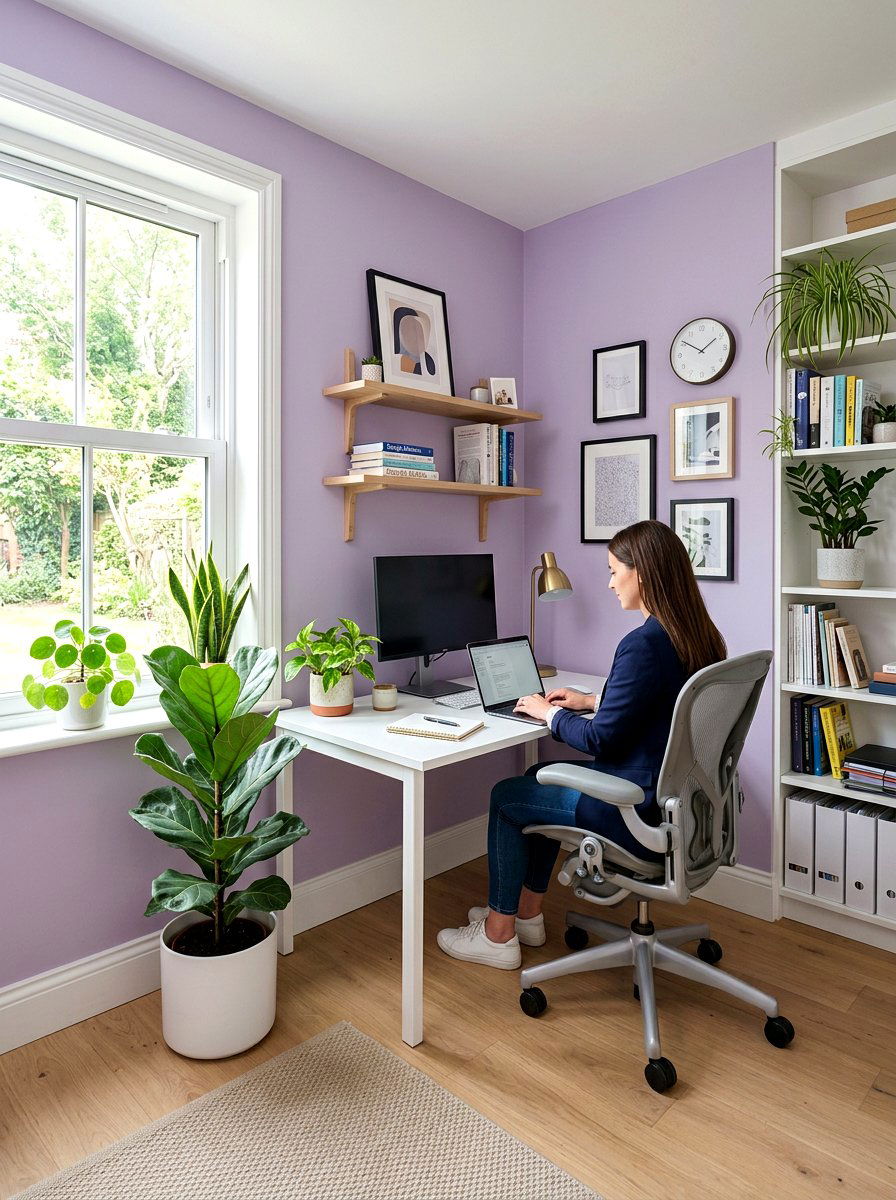
Does your workspace feel a bit uninspiring and dull lately? A lilac home office can provide the creative spark you need by introducing a soft, calming color that aids focus and mental clarity. This light purple shade is sophisticated enough for a professional setting while still feeling fresh and modern. Pair it with a clean white desk and a minimalist ergonomic chair to keep the space feeling uncluttered. Adding a few green plants provides a lovely natural contrast to the lilac walls. This palette helps to reduce stress during busy workdays, making your home office a place where you actually enjoy spending your time and being productive.
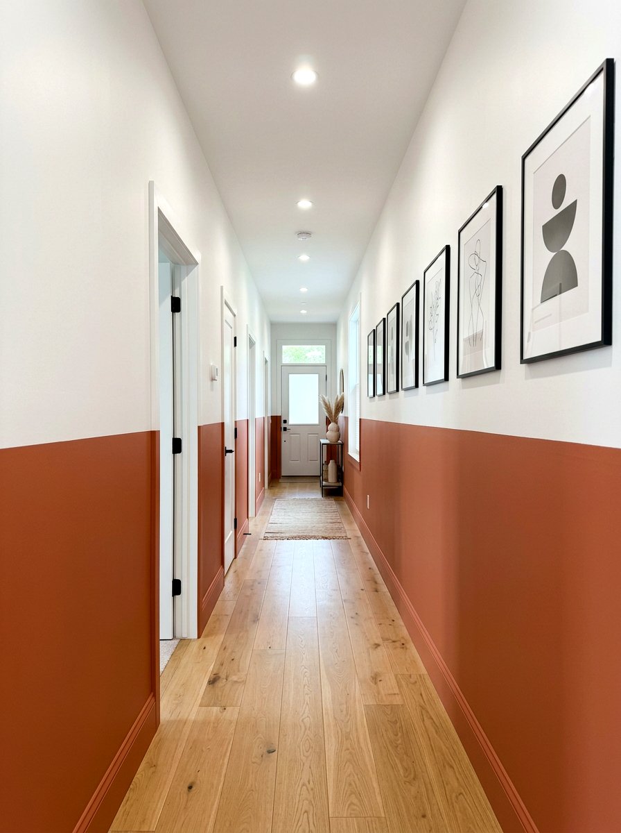
9. Soft coral entryway
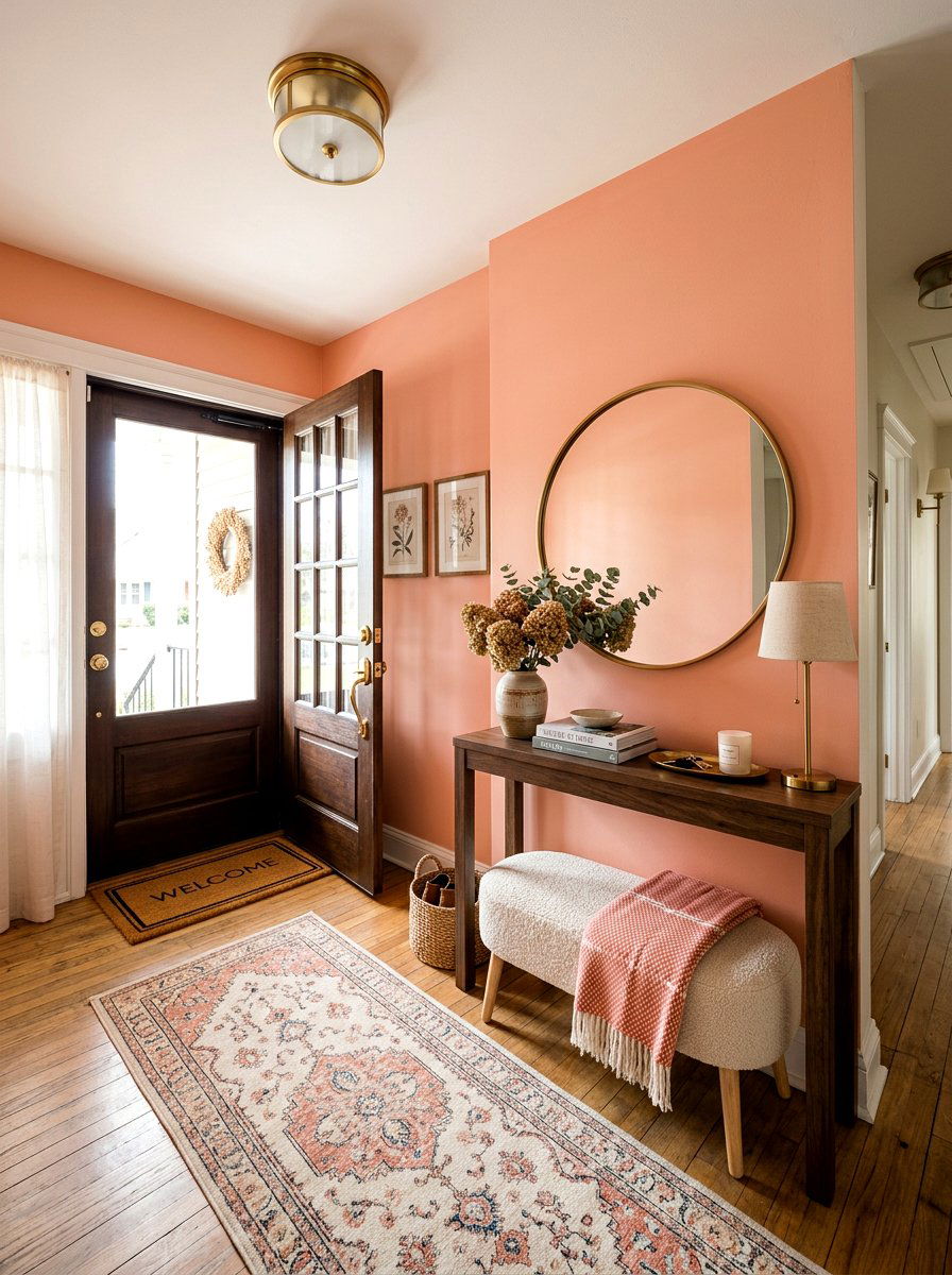
First impressions are everything when guests walk through your front door. A soft coral entryway creates an immediate sense of warmth and hospitality that feels bright and energetic. This pastel orange-pink hybrid looks stunning against light-colored flooring and white trim. You can include a simple console table with a large mirror above it to help bounce the light around the small space. Adding a few woven baskets for storage and a small bench makes the area functional as well as beautiful. It is a bold yet approachable color choice that sets a cheerful tone for the rest of your home as soon as you enter.
10. Pale turquoise laundry room
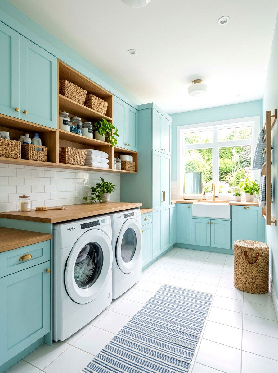
Who says a functional space like a laundry room has to be boring or clinical? A pale turquoise laundry room brings a sense of coastal freshness to a chore-heavy area, making the task feel a bit lighter. This watery pastel looks great on cabinets or as a backsplash tile color. When paired with bright white appliances and wooden shelving, it creates a clean and organized aesthetic. You can add some woven laundry hampers and glass jars for detergent to keep the look cohesive. This color choice transforms a utilitarian room into a beautiful part of the home that you won't mind spending time in each week.
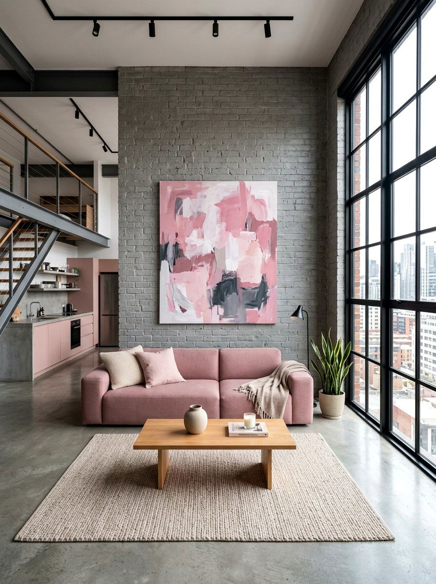
11. Dusty rose guest room
Welcoming guests into your home is always a treat, especially when you have a beautiful space prepared for them. A dusty rose guest room offers a sophisticated and vintage-inspired vibe that feels high-end and comfortable. This muted pink tone is more mature than traditional pastels and pairs perfectly with charcoal grey or navy blue accents. Use high-quality white linens and a plush duvet to make the bed the focal point of the room. Adding a small bedside carafe and a few books creates a thoughtful touch for your visitors. It is a color palette that feels timeless and ensures your guests feel truly pampered during their stay.
12. Powder blue breakfast nook
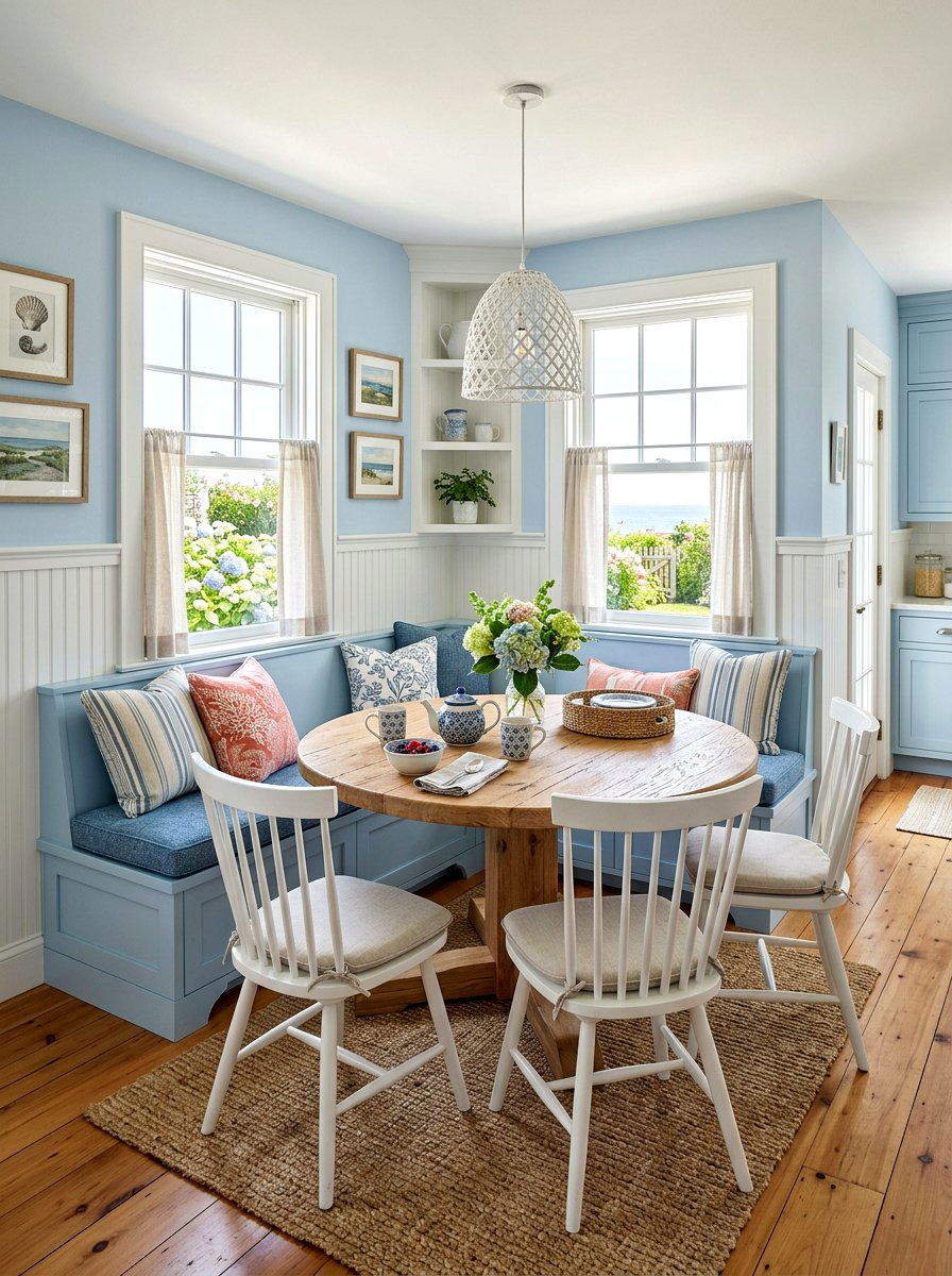
Is there anything better than enjoying a quiet breakfast in a space that feels like a clear morning sky? A powder blue breakfast nook creates a serene and refreshing start to your day. This light blue shade works wonderfully on built-in banquet seating or as a wall color behind a small bistro table. Pair it with white chairs and a light wood table to maintain the airy feel. You can add some striped blue and white cushions to give the space a subtle nautical or cottage-inspired look. This small corner becomes a peaceful retreat for sipping tea and planning your day in a calm environment.
13. Apricot patio furniture
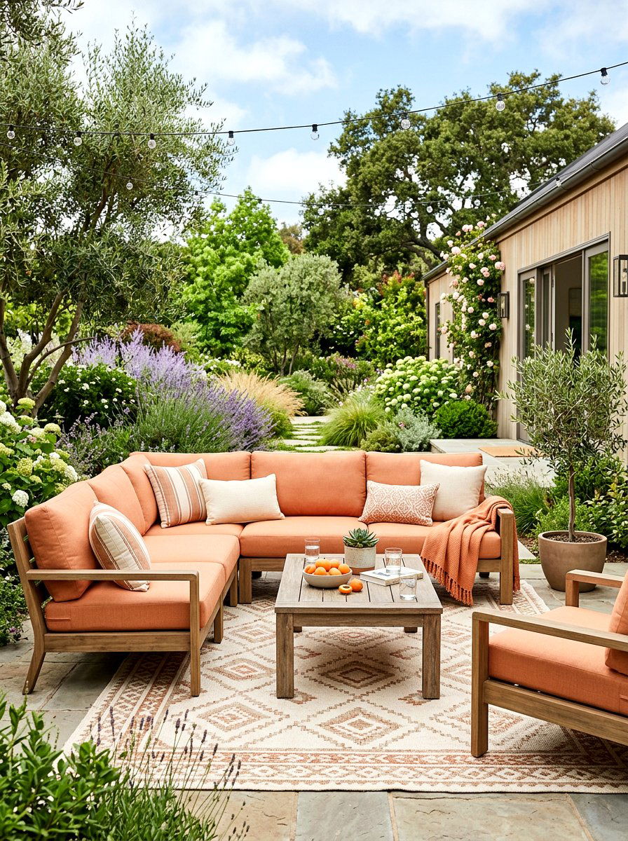
Outdoor spaces deserve just as much color attention as the interior of your home. Using apricot patio furniture is a delightful way to bring a soft, sun-kissed glow to your backyard or deck area. This pastel orange hue looks striking against the natural green of a lawn or the grey of stone pavers. You can pair apricot cushions with light-colored metal or teak wood frames for a modern look. Adding some outdoor rugs in neutral tones helps to define the seating area. This palette feels vibrant and energetic, making it the perfect setting for hosting spring garden parties or enjoying a quiet evening outside with your family.
14. Seafoam green basement
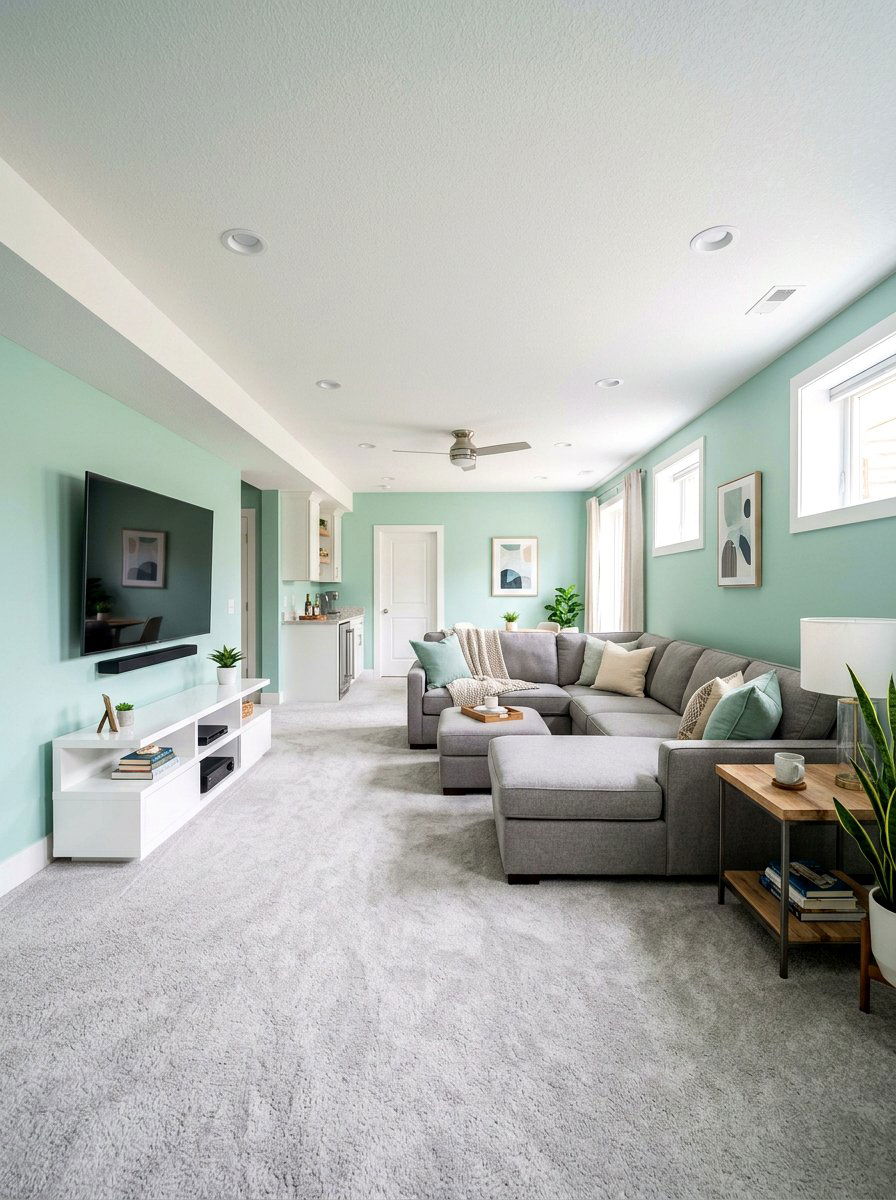
Basements can often feel dark and enclosed, but the right color can completely change that perception. A seafoam green basement introduces a light and airy feel that mimics the freshness of the ocean. This pastel green-blue shade helps to brighten up rooms with limited natural light by reflecting what little light is available. You can use it on the walls and pair it with light grey carpeting and white furniture to keep the space feeling open. Adding some colorful artwork and soft lighting helps to create a cozy family room or playroom. It turns a subterranean space into a bright and inviting part of the house.
15. Lemon chiffon hallway
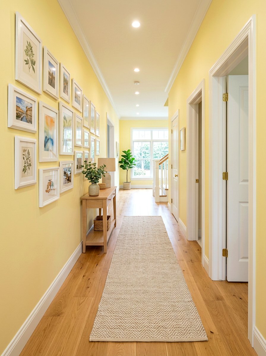
Long hallways can sometimes feel like forgotten transition spaces, but they offer a great opportunity for a color pop. A lemon chiffon hallway uses a very pale, creamy yellow to create a sense of light and movement through the home. This shade is subtle enough not to be overwhelming but bright enough to make the hallway feel wider and more welcoming. You can hang a gallery wall of family photos in white frames to add personal character. Using a light-colored runner rug protects the floor while adding texture. This simple update makes walking from room to room a much more pleasant and visually interesting experience for everyone.
16. Periwinkle master bath
Creating a luxurious master bath often involves choosing colors that feel both royal and relaxing. A periwinkle master bath offers a unique blend of blue and purple that feels incredibly fresh and sophisticated. This pastel shade looks stunning when used on a double vanity or as an accent wall behind a freestanding bathtub. Pair it with white marble floors and silver fixtures for a classic look. You can add some plush purple towels and a simple orchid to tie the whole design together. It creates a space that feels like a high-end hotel suite, providing a beautiful backdrop for your morning and evening routines.
17. Pistachio mudroom
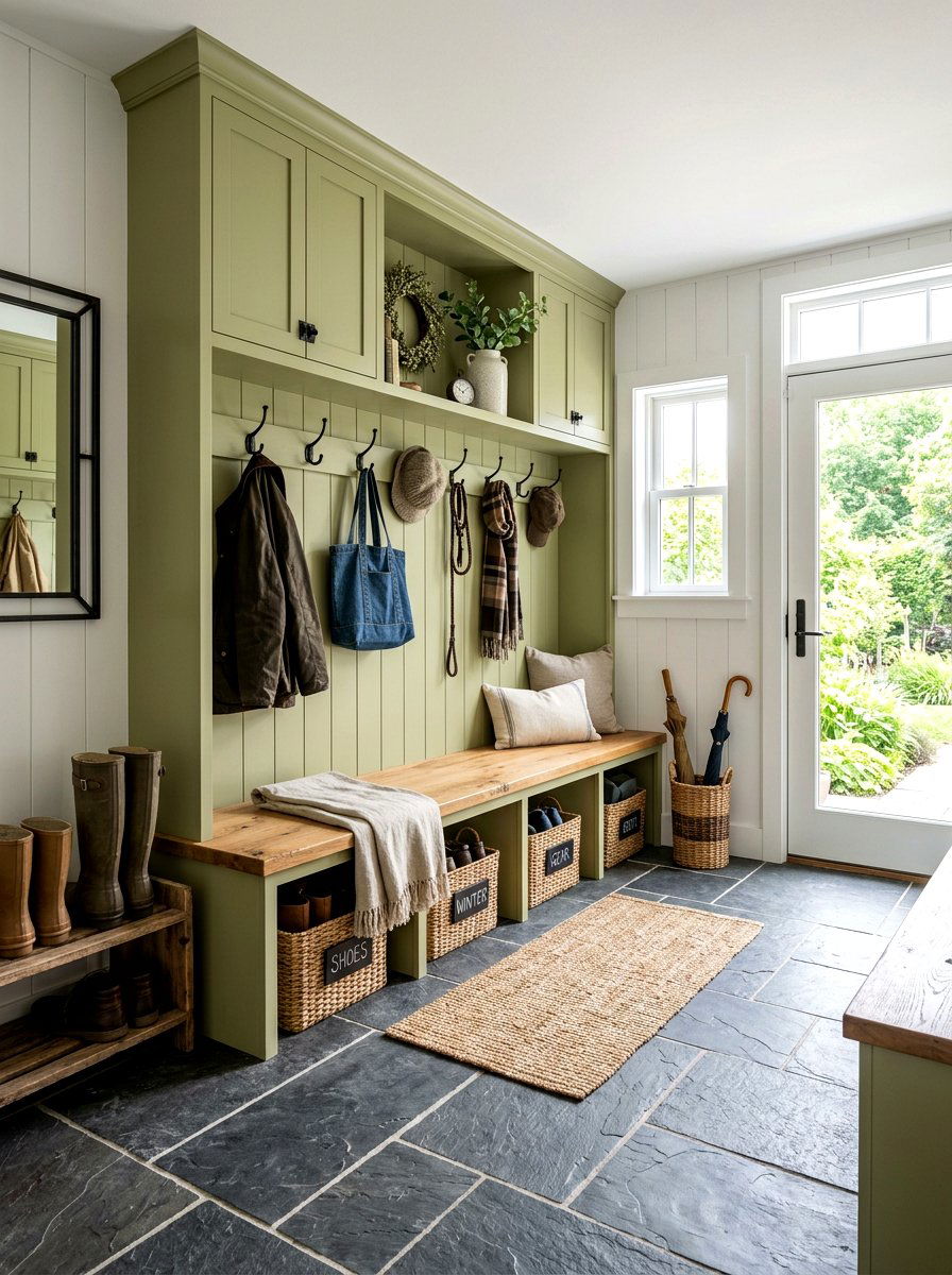
The mudroom is often the busiest part of the home, handling shoes, coats, and everything in between. A pistachio mudroom uses a soft, muted green to create a sense of organization and calm in the midst of the daily chaos. This color looks great on built-in cubbies and benches, especially when paired with natural wood tops. You can add some durable wicker baskets and black metal hooks for a functional and stylish look. This pastel shade is excellent at hiding the occasional scuff mark while still looking bright and clean. It makes coming home a much more organized and visually pleasing experience for the whole family.
18. Mauve reading nook
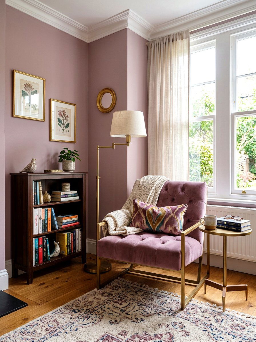
Finding a quiet corner to get lost in a book is one of life’s simple pleasures. A mauve reading nook uses a soft, dusty purple to create a space that feels intimate and cozy. This shade is perfect for a small alcove or a corner of a larger bedroom. You can add a comfortable velvet armchair in a slightly darker shade of mauve to create depth. A small gold floor lamp and a wooden side table provide the necessary function for your reading time. This color palette feels grounded and sophisticated, offering a mature take on pastels that encourages relaxation and quiet reflection in your favorite home corner.
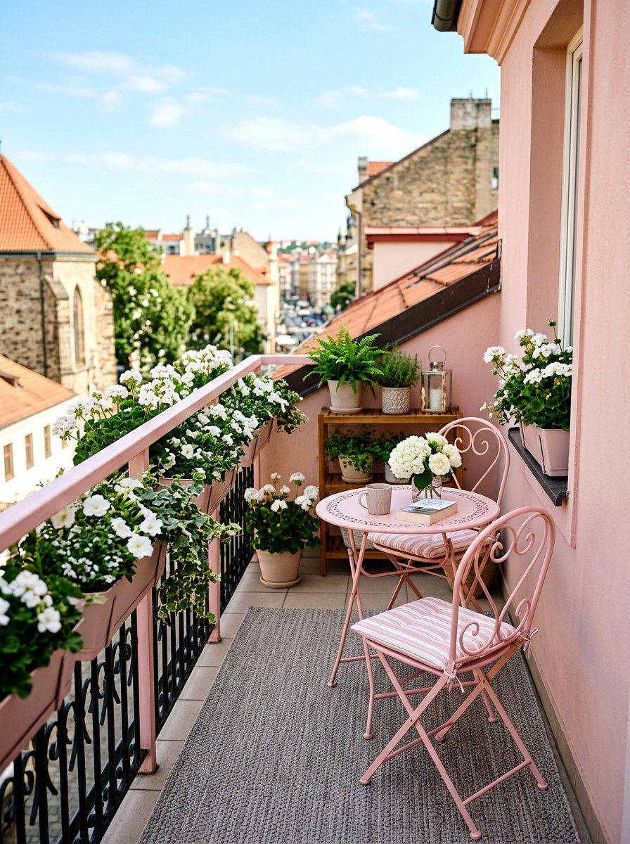
19. Pale pink balcony
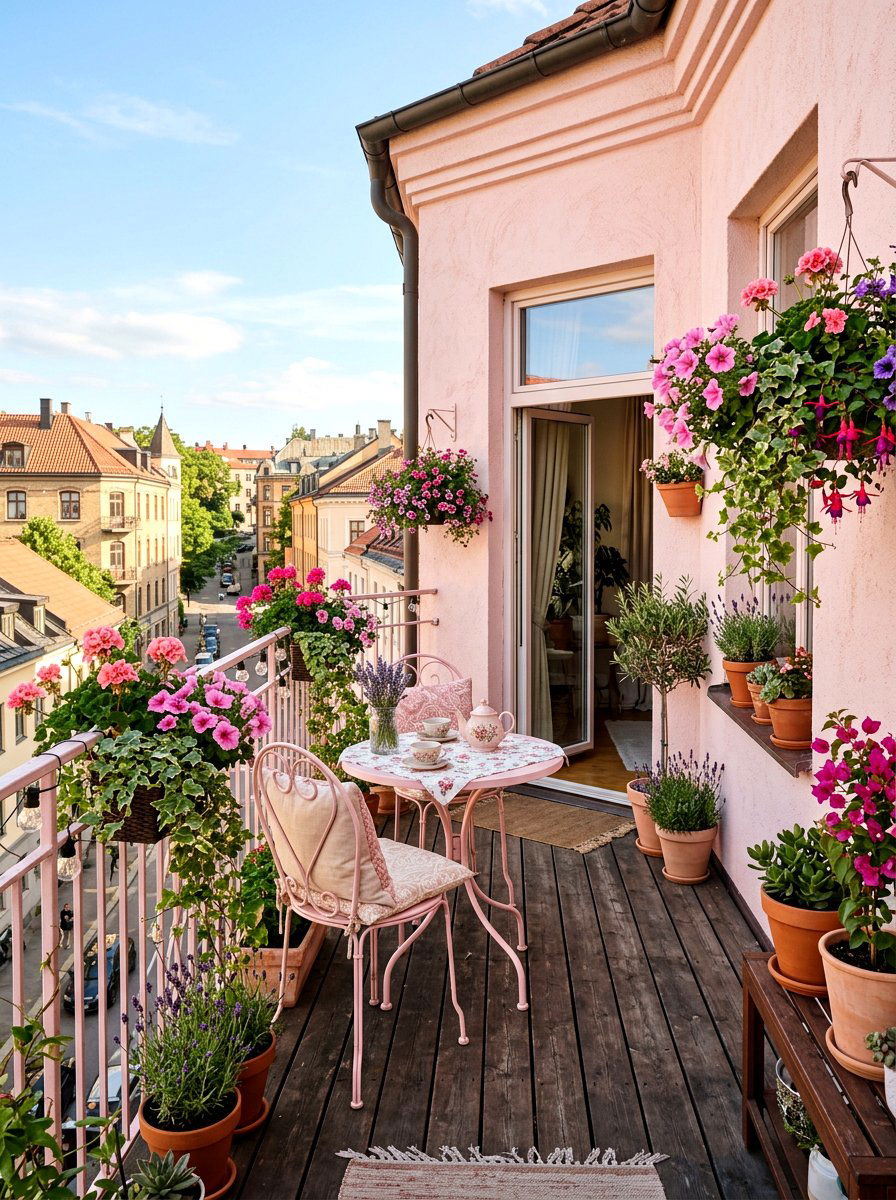
Even the smallest outdoor spaces can benefit from a thoughtful color palette during the spring. A pale pink balcony uses soft rose tones to create a charming and whimsical outdoor retreat. You can paint a small bistro set in this pastel shade or use pink outdoor cushions on wooden chairs. Adding some hanging planters with white flowers and green vines creates a lovely garden feel. This color looks beautiful against the backdrop of a city skyline or a backyard view. It transforms a simple balcony into a stylish spot for enjoying a glass of lemonade while watching the sunset on a warm spring evening.
20. Aqua outdoor seating
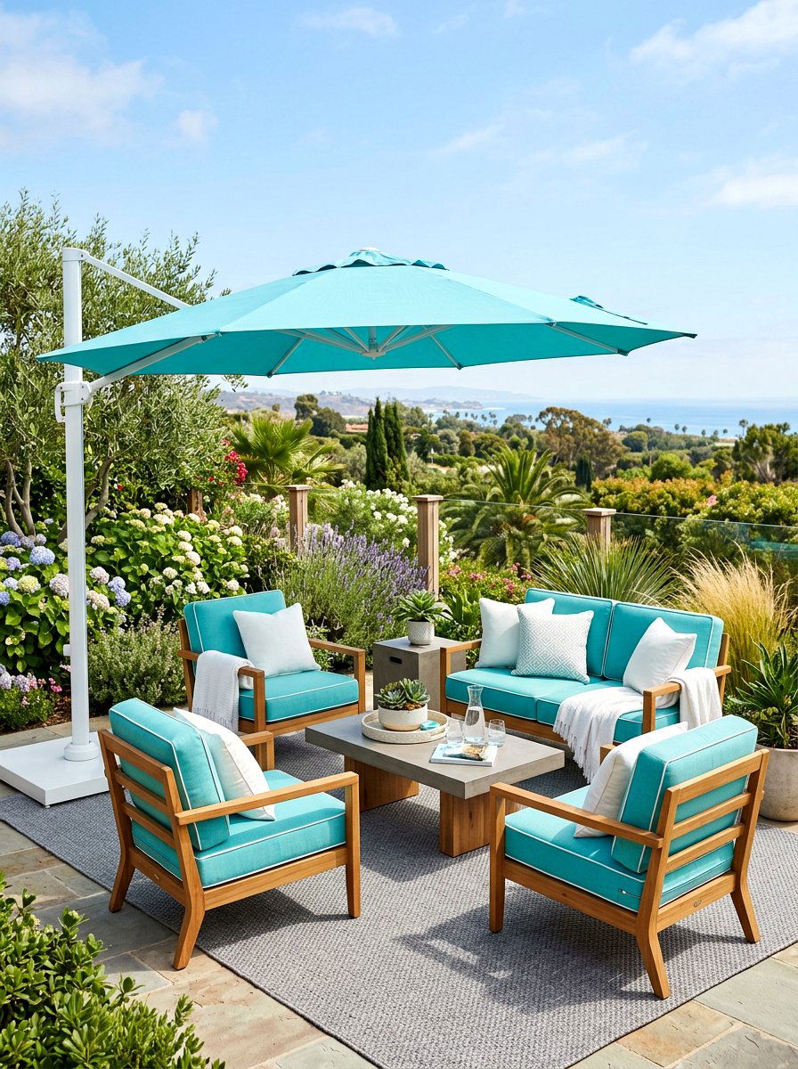
Creating a focal point in your backyard is easy when you use a refreshing color like aqua. Aqua outdoor seating brings a cool, coastal vibe to your patio or deck that feels instantly relaxing. This bright pastel blue looks incredible when paired with white outdoor pillows and a light grey rug. You can use large outdoor umbrellas in a matching shade to provide shade and a cohesive look. This palette works well with both modern and traditional outdoor furniture styles. It makes your backyard feel like a vacation destination, providing a perfect setting for summer BBQs and family gatherings under the bright spring sun.
21. Rose quartz fireplace room
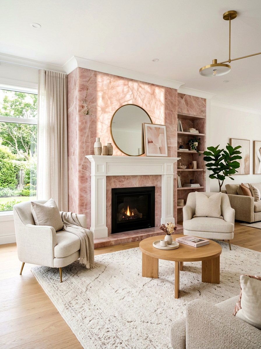
The area around a fireplace is naturally a focal point, and using the right color can enhance its beauty. A rose quartz fireplace room uses a very pale, crystalline pink to create a soft and elegant atmosphere. This shade looks stunning on the walls surrounding a white mantel or a light stone hearth. You can add some neutral-colored armchairs and a soft cream rug to keep the focus on the fireplace. This palette feels modern and fresh, providing a beautiful contrast to the warm glow of a fire. It creates a sophisticated lounge area that is perfect for hosting friends or enjoying a quiet evening at home.
22. Celadon green attic
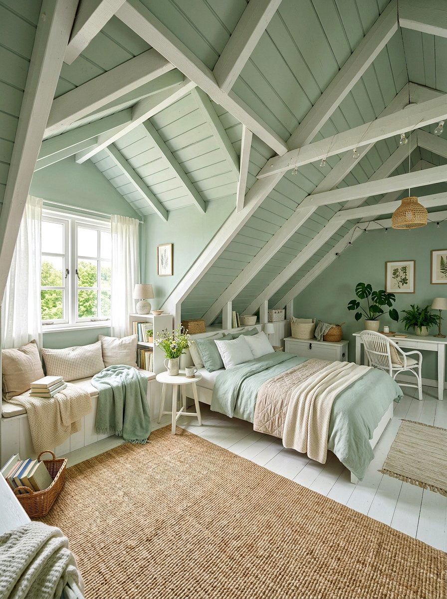
Attic spaces often have unique architectural angles that can be highlighted with the right color. A celadon green attic uses a soft, greyish-green pastel to create a peaceful and airy hideaway. This color works beautifully on sloped ceilings, making the space feel more open and less cramped. You can use it for a guest bedroom or a quiet home office away from the noise of the main house. Pair it with white furniture and light-colored textiles to maintain the bright feel. This shade of green is very soothing and connects the indoor space with the treetops visible through the attic windows.
23. Creamy beige lounge
Sometimes the best way to use pastels is to lean into the most neutral shades available. A creamy beige lounge offers a warm and sophisticated environment that feels incredibly high-end. This is not a boring tan; it is a rich, buttery pastel that glows in natural light. You can layer different textures like a wool rug, linen curtains, and a leather ottoman to add visual interest. This monochrome approach creates a seamless and calm look that is perfect for a formal sitting room or a cozy den. It provides a timeless backdrop that allows your favorite art pieces and decorative accessories to really shine.
24. Orchid flower sunroom
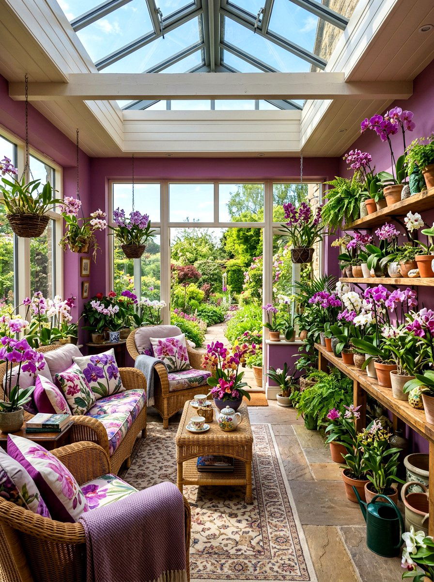
If you want a space that feels truly connected to the blooming flowers of spring, an orchid flower sunroom is the way to go. This soft, pinkish-purple shade mimics the delicate petals of spring blossoms and creates a vibrant yet soothing atmosphere. It looks incredible when paired with white floor-to-ceiling windows and green indoor trees. You can add some comfortable wicker seating with floral cushions to enhance the garden theme. This room becomes a bright and cheerful sanctuary where you can enjoy the beauty of nature while being protected from the elements. It is a bold color choice that feels joyful and full of life.
25. Mint and gold vanity
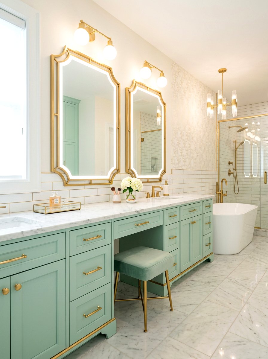
A bathroom vanity area is the perfect place to experiment with a fun and fresh color combination. A mint and gold vanity uses a soft mint green for the cabinetry and polished gold for the hardware and mirrors. This pairing feels incredibly modern and glamorous, providing a refreshing update to a standard bathroom layout. You can use white marble for the countertop to keep the look clean and sophisticated. Adding some small glass jars for cotton balls and a few white towels completes the aesthetic. It creates a beautiful and functional space that makes your morning grooming routine feel like a luxury experience every single day.
Conclusion:
Refreshing your home with a spring pastel color palette is a wonderful way to embrace the new season and improve your living environment. These soft and airy hues offer a perfect balance between subtle neutrality and vibrant personality, making them suitable for any room in the house. Whether you prefer the calming effect of sage green or the cheerful glow of butter yellow, there is a pastel shade that will fit your personal style. By carefully choosing your furniture and accents, you can create a cohesive and inviting space that feels both modern and timeless. We hope these twenty-five ideas inspire you to bring the beauty of spring indoors and transform your home into a bright, colorful sanctuary that you love spending time in.
Related posts:
Leave a Reply