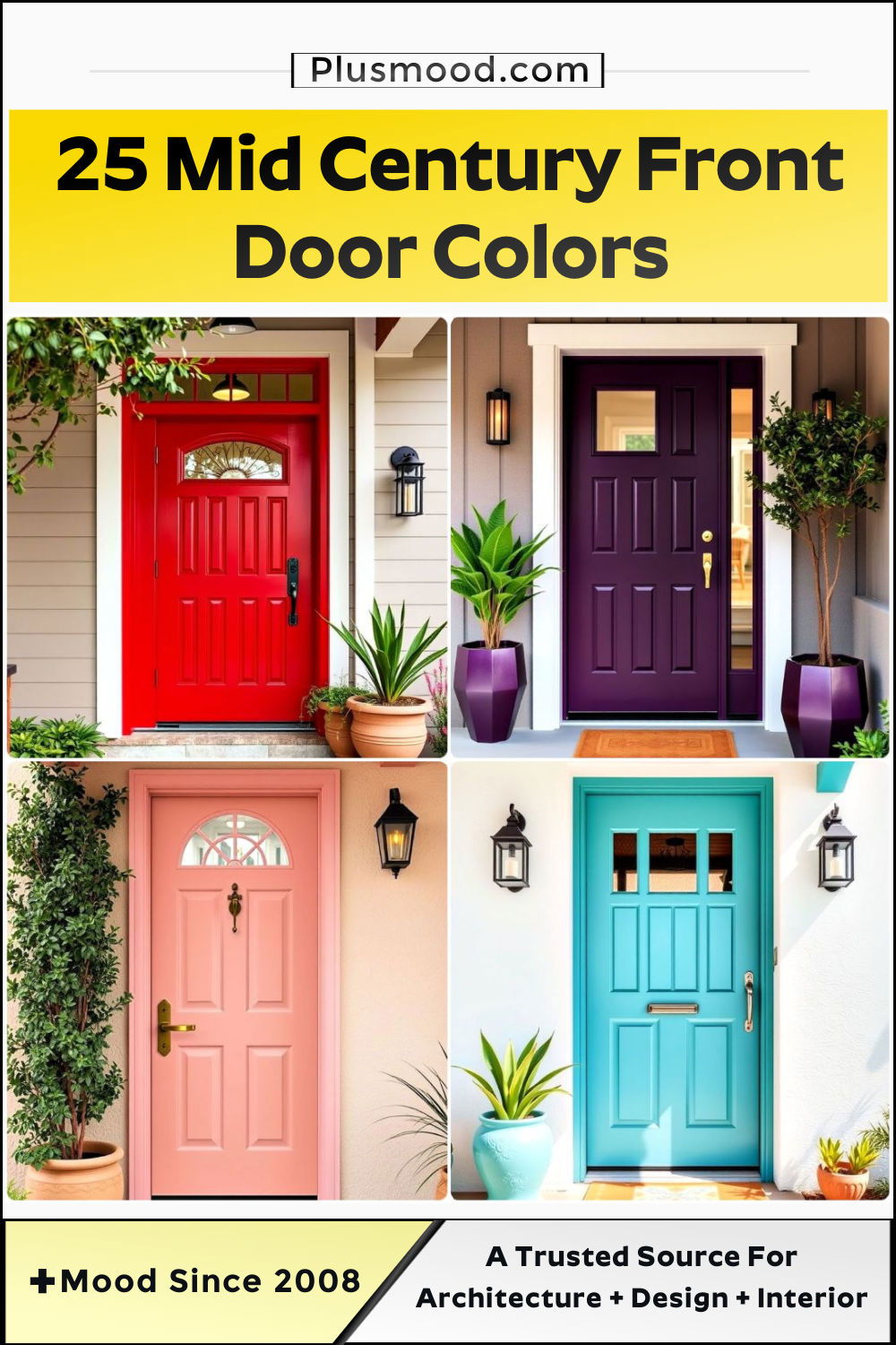
A front door isn’t just an entrance—it’s a canvas that sets the tone for your home’s personality and charm. In the world of mid-century modern design, bold and creative door colors became iconic symbols of innovation, simplicity, and a deep connection to nature. From vibrant reds to calming greens, each shade tells a story, blending retro flair with timeless elegance. If you’re ready to embrace the beauty of mid-century design, these 25 front door colors are the perfect way to make an unforgettable first impression.
1. Vibrant Teal
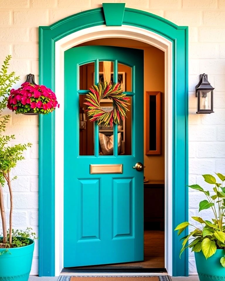
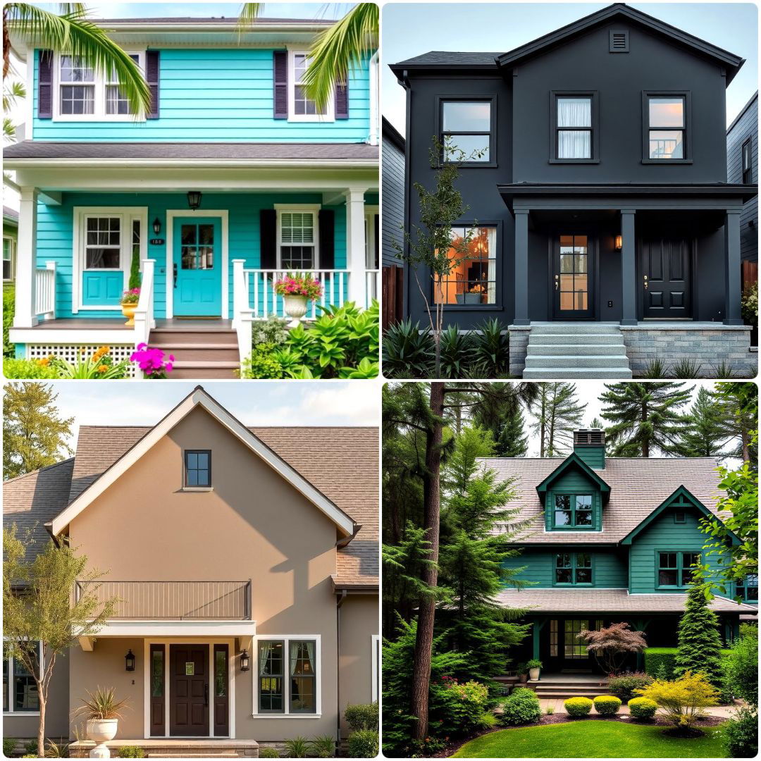
A vibrant teal front door can instantly add a pop of mid-century charm to your home. This bold yet balanced hue offers a blend of sophistication and playfulness, perfect for making a striking first impression. Pair it with neutral or earthy exteriors to let the color shine, or complement it with warm woods for a harmonious retro vibe. Teal embodies a classic mid-century palette, making it ideal for anyone seeking to blend vintage aesthetics with modern flair.
2. Burnt Orange
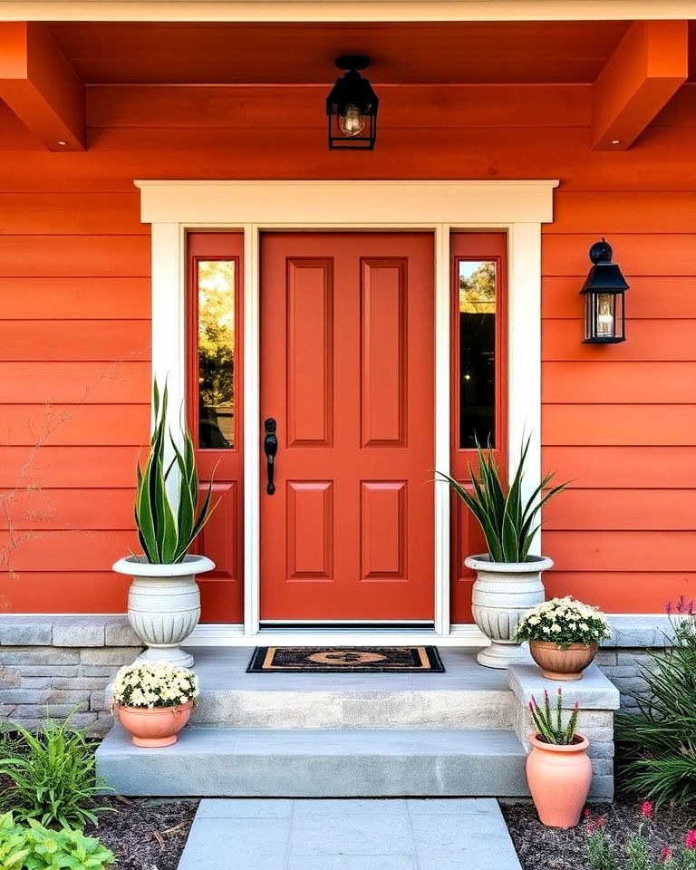
Burnt orange is a quintessential mid-century color that radiates warmth and personality. Its earthy undertones create a welcoming vibe while staying true to the retro aesthetic. This bold choice works wonderfully with muted greens, creams, or natural wood siding. By incorporating burnt orange, you achieve a dynamic yet balanced look that nods to mid-century design principles without overwhelming the overall facade.
3. Mustard Yellow
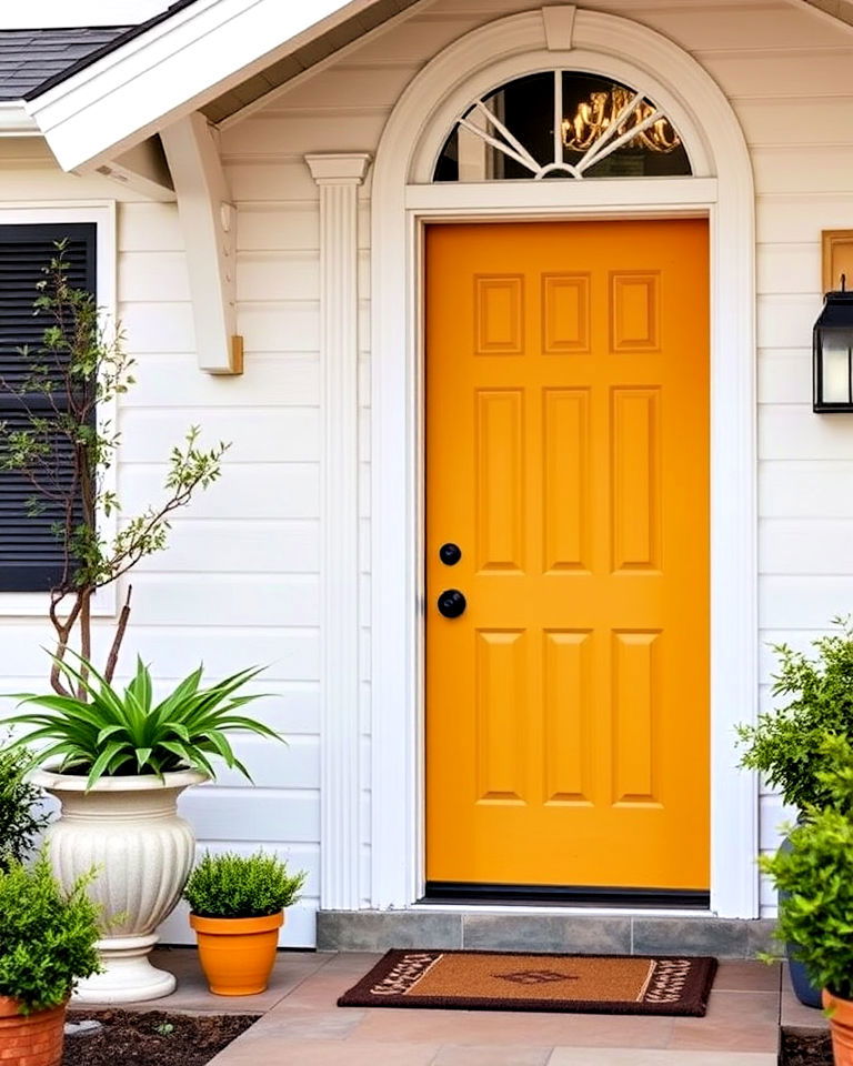
Bring sunny optimism to your entryway with a mustard yellow door. This rich, golden shade adds depth and character while remaining versatile enough to pair with various exterior styles. Whether your home features clean white lines or darker tones, mustard yellow evokes a cheerful yet sophisticated mid-century feel. Its timeless appeal ensures your home feels both retro and relevant.
4. Olive Green
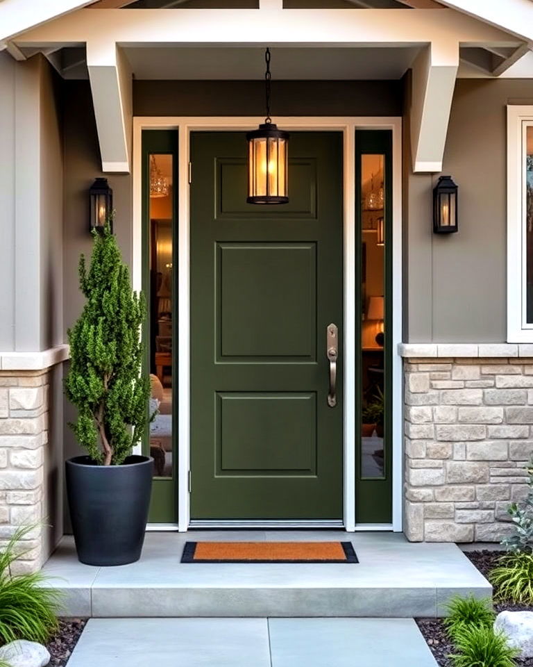
Olive green delivers a sophisticated mid-century modern vibe that's both subtle and striking. This muted hue pairs beautifully with natural materials like stone and wood, creating a cohesive, earthy aesthetic. Olive green works particularly well with homes featuring neutral or monochromatic exteriors, providing just enough contrast to stand out without overpowering the design.
5. Soft Turquoise
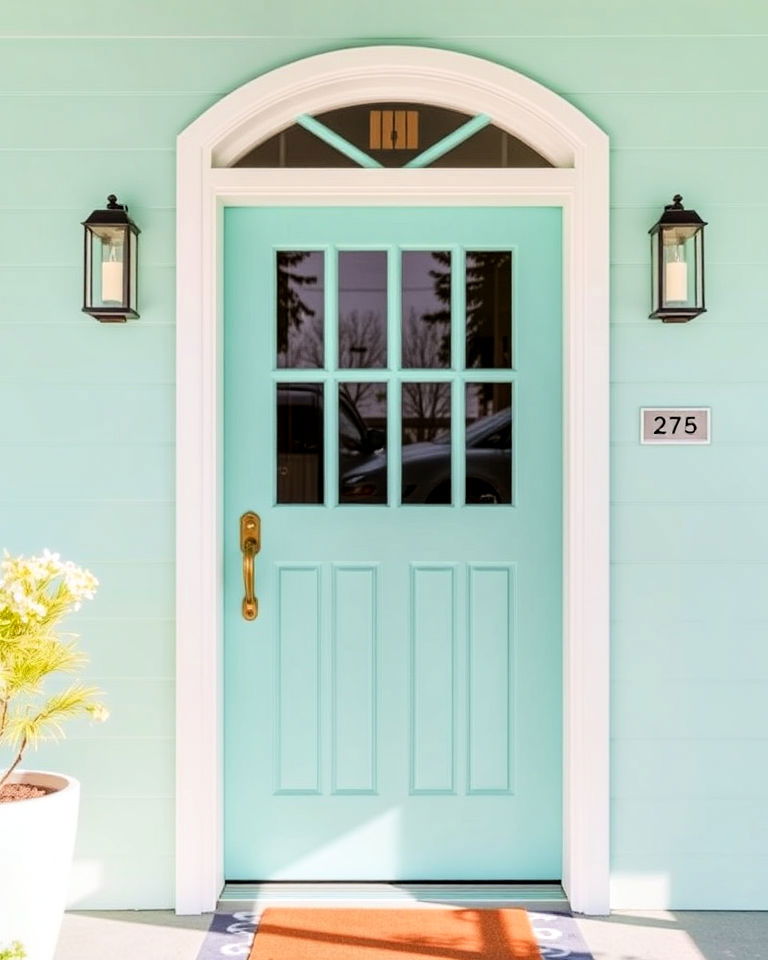
Soft turquoise exudes a breezy, retro charm perfect for a mid-century aesthetic. This calming shade works well with crisp white or dark gray exteriors, adding a playful yet elegant touch. Turquoise is a classic color choice for mid-century modern enthusiasts, reflecting the era's love for bright, airy palettes that feel fresh and inviting.
6. Deep Navy Blue
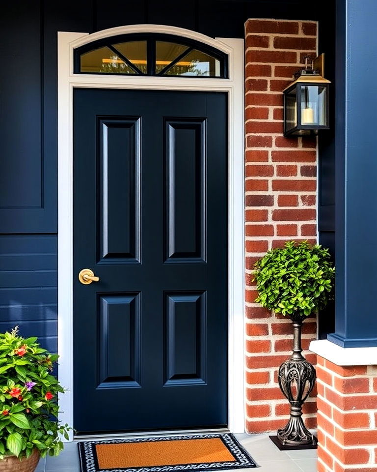
Deep navy blue combines classic elegance with mid-century flair, creating a grounded yet striking look. This timeless shade harmonizes beautifully with neutral or warm-toned exteriors, such as white, beige, or even brick. Navy’s bold depth pairs exceptionally well with metallic hardware in brass or chrome, elevating the overall sophistication. Its versatility ensures it complements both minimalist and richly detailed mid-century architecture, making your entryway a statement piece that’s both modern and retro.
7. Coral Pink
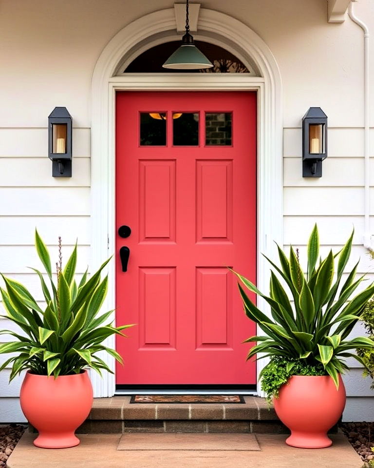
Coral pink infuses your front door with a playful yet refined mid-century aesthetic. This cheerful hue offers a delightful contrast against darker exteriors like charcoal or navy, while also pairing beautifully with white or beige facades. Its warm undertones evoke a sense of nostalgia, perfectly balancing vibrancy and softness. To accentuate the retro vibe, pair coral pink with geometric planters or mid-century lighting fixtures, transforming your entryway into a welcoming focal point.
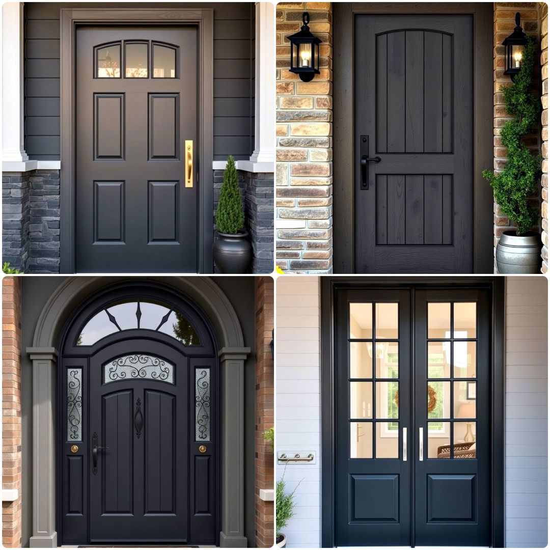
8. Charcoal Gray
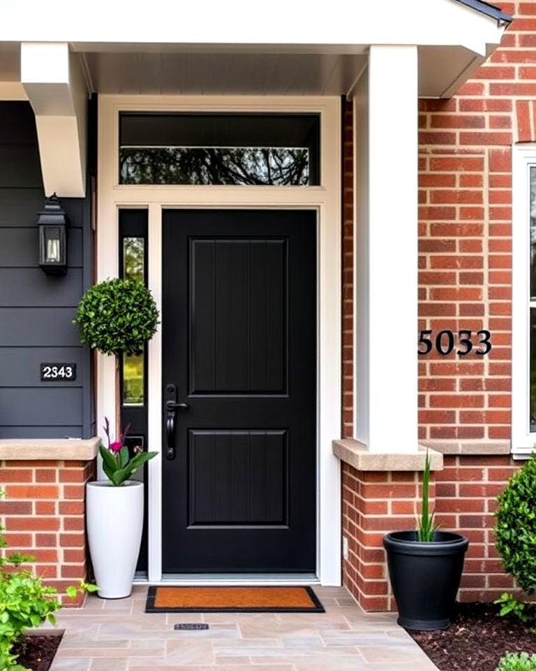
Charcoal gray provides a sleek, modern twist on mid-century design, exuding understated sophistication. This neutral yet bold choice pairs effortlessly with both lighter shades, like cream or white, and darker materials, such as brick or stone. The deep tone offers a striking backdrop for bright accents like colorful house numbers or vibrant greenery. Whether your style leans minimalist or dramatic, charcoal gray enhances mid-century architecture with a refined and timeless appeal.
9. Bright Red
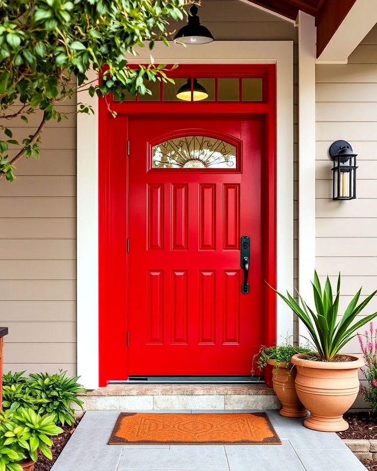
Bright red makes a daring and unforgettable statement for a mid-century front door. This energetic hue captures the era’s love for bold contrasts and clean lines, creating a vibrant focal point. Red pairs exceptionally well with neutral facades, such as white or beige, and natural elements like wood or stone. For an authentic retro touch, combine this fiery shade with mid-century hardware in chrome or black, ensuring your entry radiates confidence and warmth.
10. Forest Green
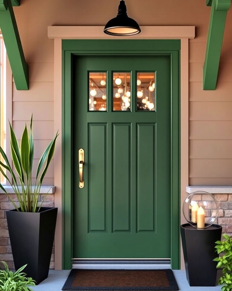
Forest green offers a rich, earthy tone that grounds your mid-century home in natural sophistication. This shade pairs beautifully with neutral exteriors, such as taupe or cream, and accentuates wood or stone elements. Forest green embodies the era’s connection to organic materials and outdoor-inspired palettes. To complete the look, add mid-century touches like angular planters or vintage lighting, creating a serene yet striking entryway.
11. Aqua Blue
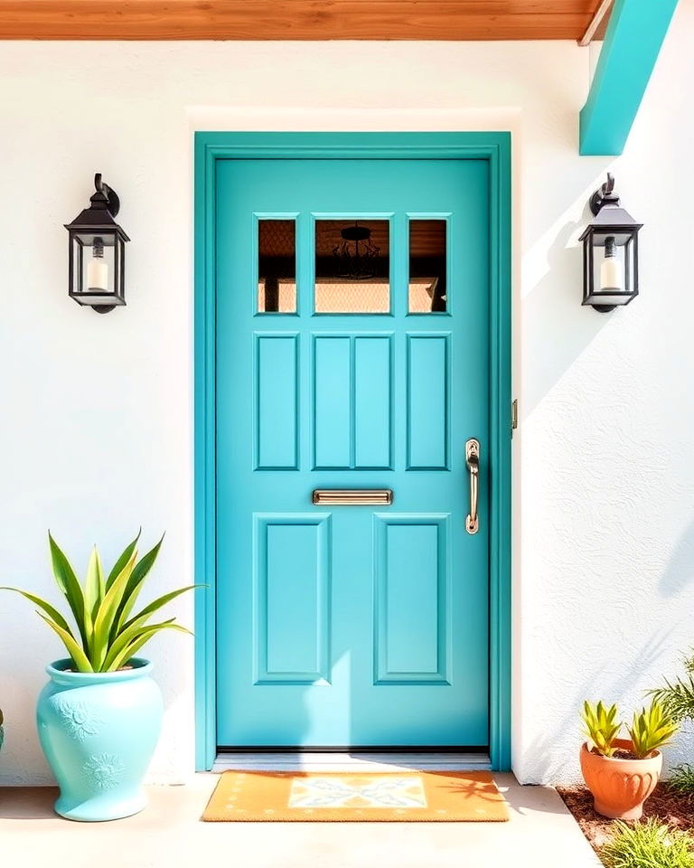
Aqua blue embodies the breezy, optimistic spirit of mid-century design. This vibrant yet soothing shade brightens any facade and pairs beautifully with neutral or pastel exteriors. Its fresh, aquatic hue works especially well with chrome hardware or geometric patterns, creating a retro-modern vibe. Whether paired with white stucco or wood accents, aqua blue exudes a cheerful charm that welcomes visitors with a timeless sense of style.
12. Terracotta
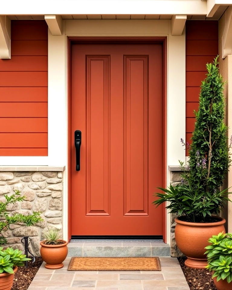
Terracotta brings warmth and character to your mid-century front door, offering an earthy, muted tone that feels both retro and contemporary. This rich color pairs wonderfully with natural wood siding, cream exteriors, or stone elements, adding depth and texture. Its understated elegance complements the clean lines of mid-century design, making it a perfect choice for those seeking a subtle yet impactful front door color.
13. Mint Green
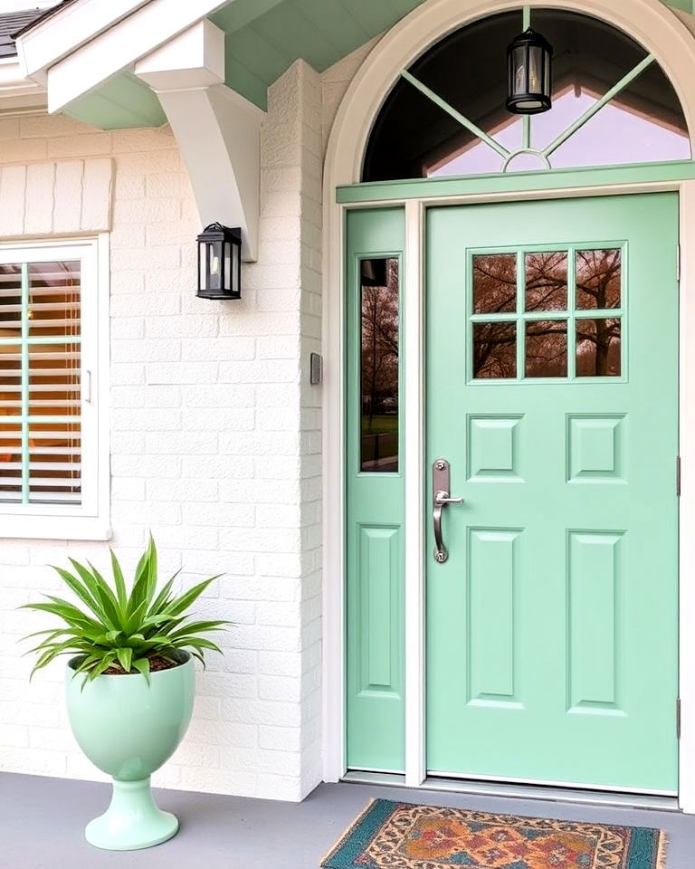
Mint green is a quintessential mid-century hue that exudes freshness and nostalgia. This pastel shade adds a soft, inviting touch to your entryway and pairs beautifully with crisp whites or muted grays. Mint green’s delicate vibrancy feels both playful and elegant, making it an excellent choice for complementing retro architectural features like angled roofs or wide windows. Enhance its charm with polished metal hardware or simple geometric accents.
14. Goldenrod
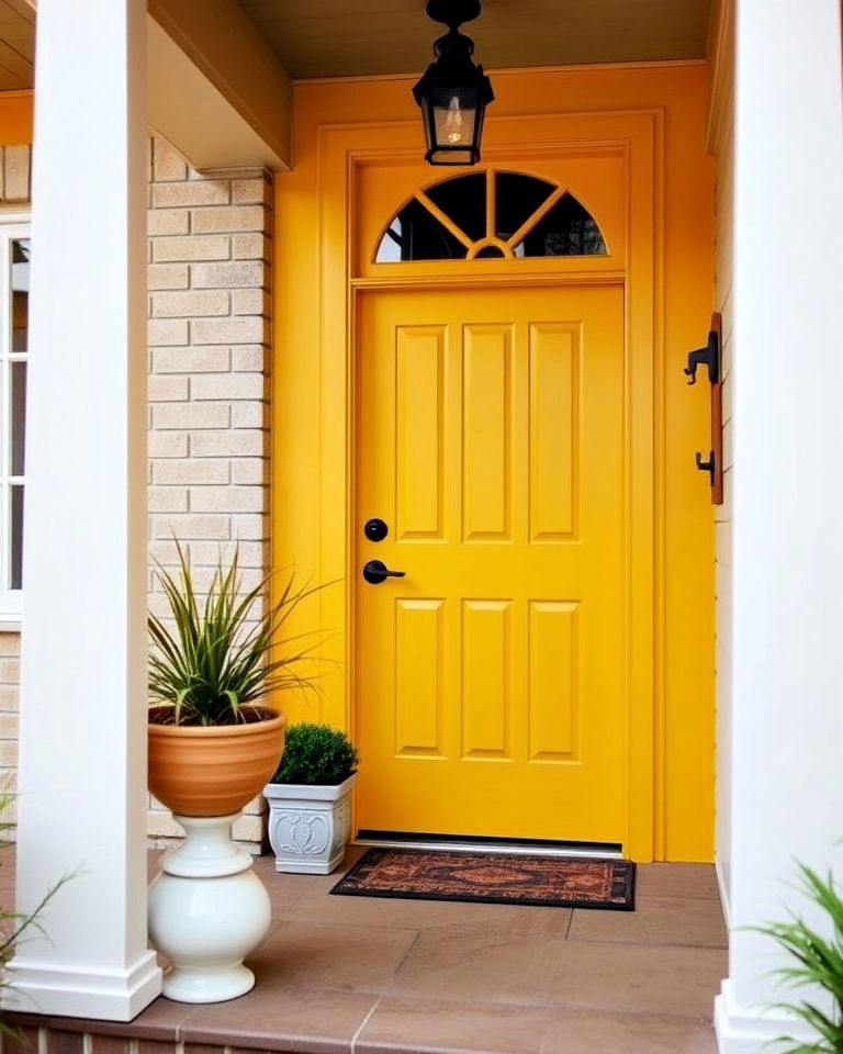
Goldenrod is a bold and sunny choice that radiates energy and warmth, perfectly reflecting the mid-century aesthetic. This rich yellow shade pairs beautifully with earthy tones like brown or olive green, as well as neutral palettes. Its vibrant presence draws attention to your front door, creating a cheerful focal point. Goldenrod works especially well when paired with mid-century details such as angular shapes, clean lines, and retro lighting.
15. Cobalt Blue
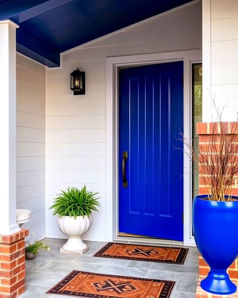
Cobalt blue adds a dramatic and regal touch to mid-century modern homes, combining boldness with sophistication. This intense shade contrasts beautifully with neutral exteriors, such as white or beige, while also complementing wood and brick finishes. Cobalt blue’s striking vibrancy creates a dynamic focal point for your entryway. For an added retro flair, pair it with sleek metallic hardware or a large, circular doorknob.
16. Blush Pink
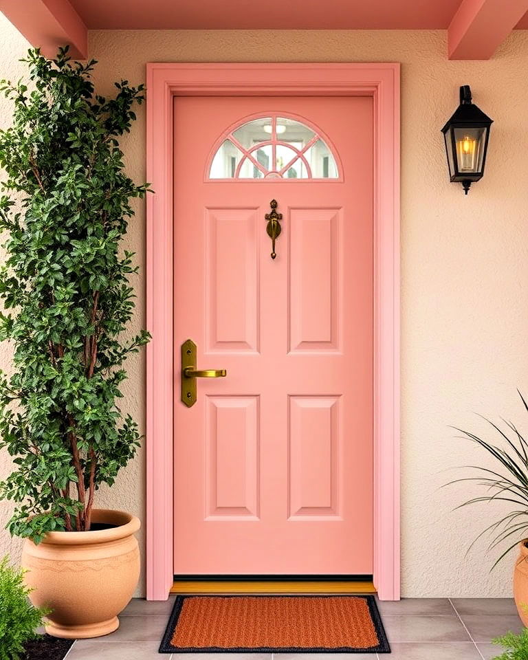
Blush pink offers a soft, elegant alternative for mid-century enthusiasts seeking a more understated palette. This delicate hue complements neutral or warm-toned exteriors, such as cream or taupe, creating a gentle yet impactful contrast. Blush pink pairs beautifully with bronze or brass hardware, enhancing its retro charm. Its subtle warmth evokes mid-century nostalgia while adding a contemporary twist to your home’s entrance.
17. Plum Purple
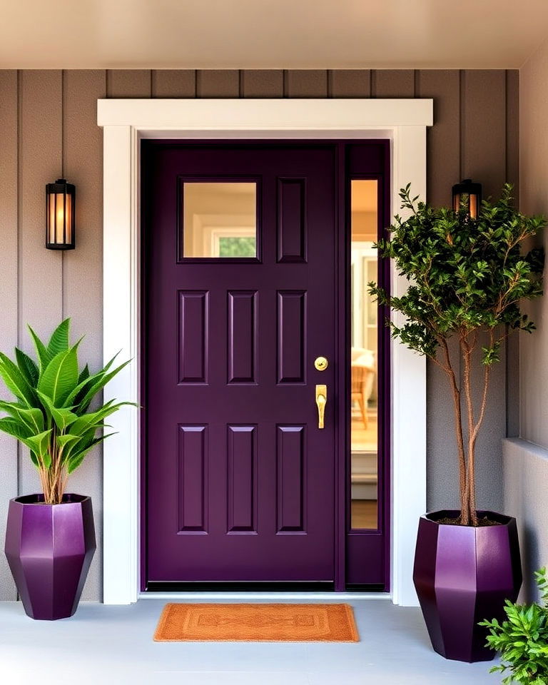
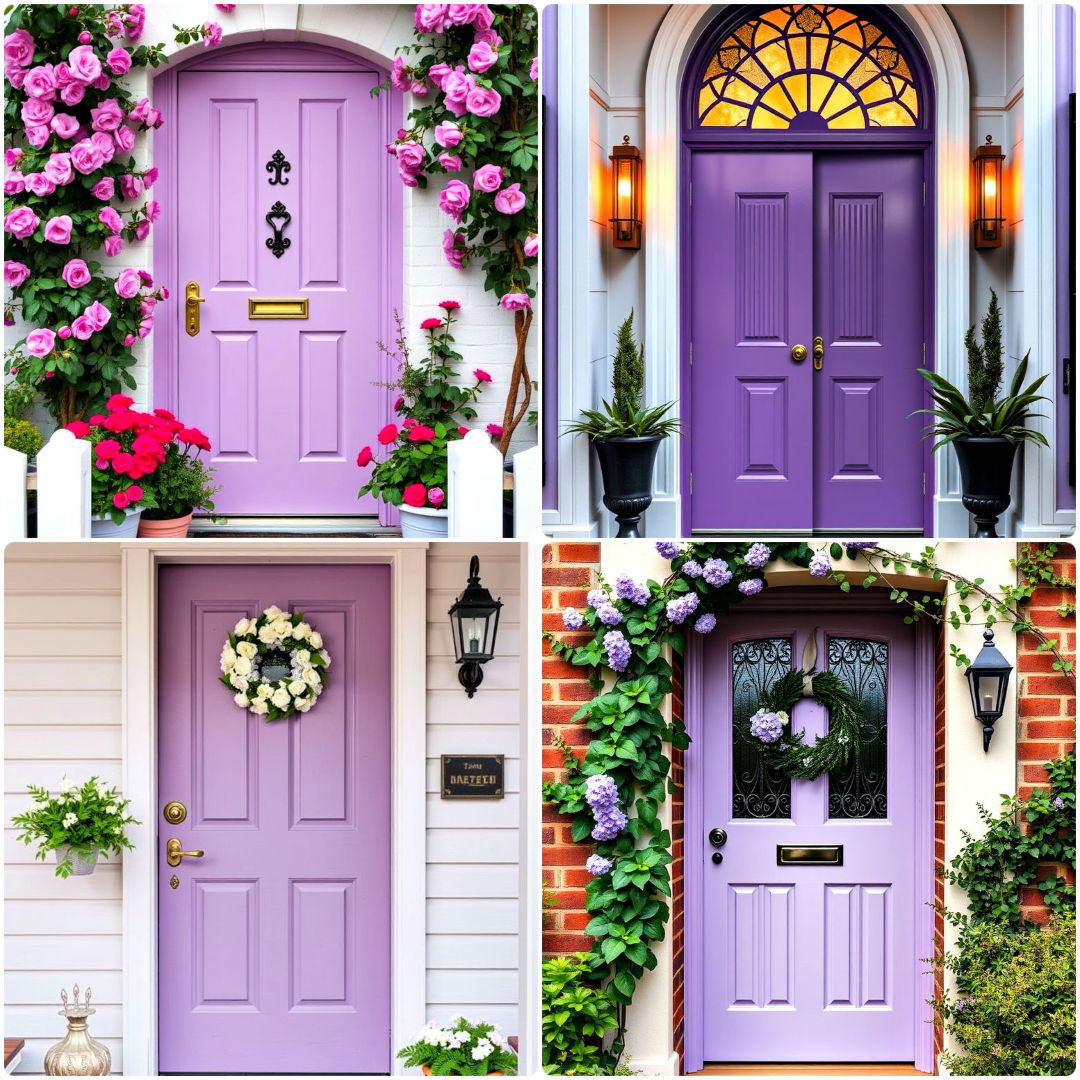
Plum purple brings a sense of luxury and drama to mid-century homes. This deep, rich shade works wonderfully with lighter exteriors, such as beige or gray, and adds a striking contrast to natural wood or stone accents. Plum purple is an unconventional choice that stands out while maintaining an air of sophistication. To complete the look, incorporate geometric elements or metallic finishes for a cohesive mid-century modern feel.
18. Creamy Beige
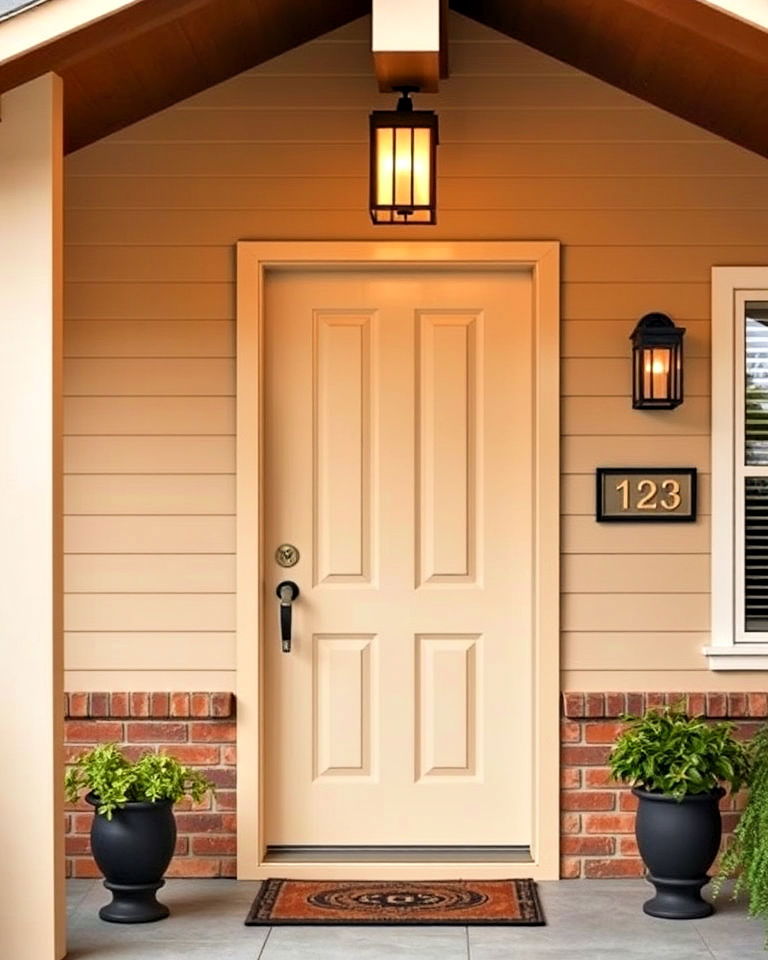
Creamy beige offers a neutral yet stylish front door option for mid-century homes. Its warm undertones create a subtle elegance, complementing wood, brick, or brightly colored exteriors. This versatile shade enhances the clean lines and minimalist aesthetic of mid-century design, serving as a perfect backdrop for bold accents like retro house numbers or statement lighting. Creamy beige provides a timeless and inviting appeal.
19. Tangerine Orange
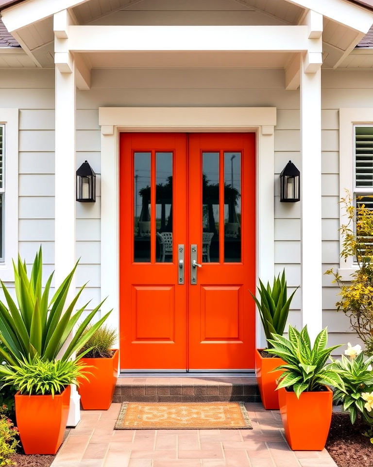
Tangerine orange captures the vibrant energy of mid-century design, adding a bold pop of color to your entryway. This cheerful hue works beautifully with white, gray, or wood exteriors, creating a striking and retro-inspired contrast. Tangerine’s warmth and brightness make it a perfect choice for welcoming guests. Pair it with modern metallic hardware or geometric planters for a cohesive mid-century look.
20. Sky Blue
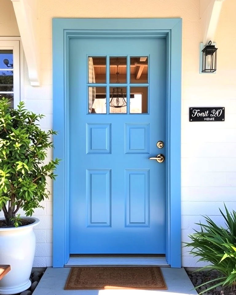
Sky blue brings a light, airy feel to mid-century homes, evoking a sense of openness and calm. This soft yet vibrant color pairs effortlessly with neutral or pastel exteriors, enhancing the overall aesthetic. Sky blue complements mid-century architectural features, such as wide windows or angled roofs, while maintaining a fresh and inviting vibe. Add chrome or brass hardware for a polished finish.
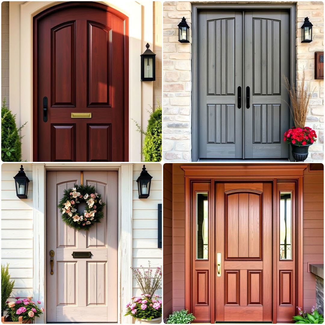
21. Rust Red
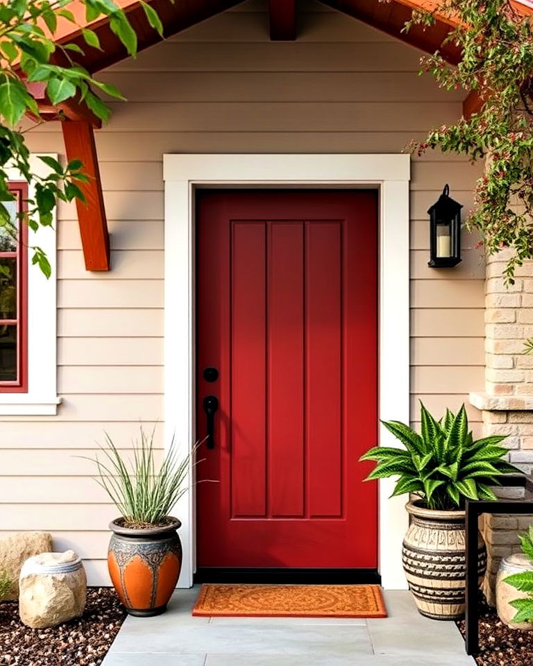
Rust red offers an earthy, sophisticated hue that embodies mid-century modern warmth. This deep shade pairs well with neutral exteriors, wood accents, or natural stone, creating a harmonious and organic look. Rust red stands out without overpowering, providing a perfect blend of boldness and subtlety. Complement it with black or bronze hardware for a cohesive, retro-inspired entryway.
22. Cool Gray
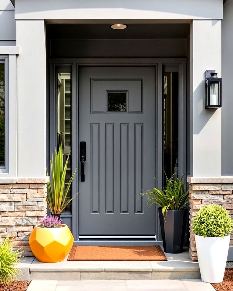
Cool gray delivers a modern yet understated front door option, blending seamlessly with mid-century aesthetics. Its versatile hue complements any exterior, from wood and stone to brighter colors like mustard or turquoise. Cool gray’s neutrality makes it an excellent choice for showcasing bold accents, such as colorful planters or geometric designs. Its timeless elegance ensures your entry remains stylish and welcoming.
23. Pale Yellow
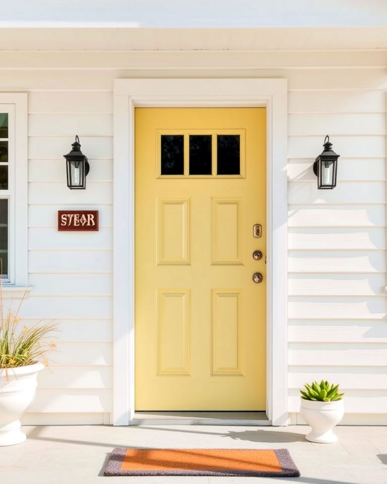
Pale yellow brings a cheerful and inviting touch to mid-century exteriors, offering a softer alternative to brighter yellows. This subtle shade pairs beautifully with white, gray, or wood finishes, adding a gentle warmth to your entryway. Pale yellow reflects the era’s playful yet refined style, making it an ideal choice for creating a bright and welcoming focal point.
24. Sage Green
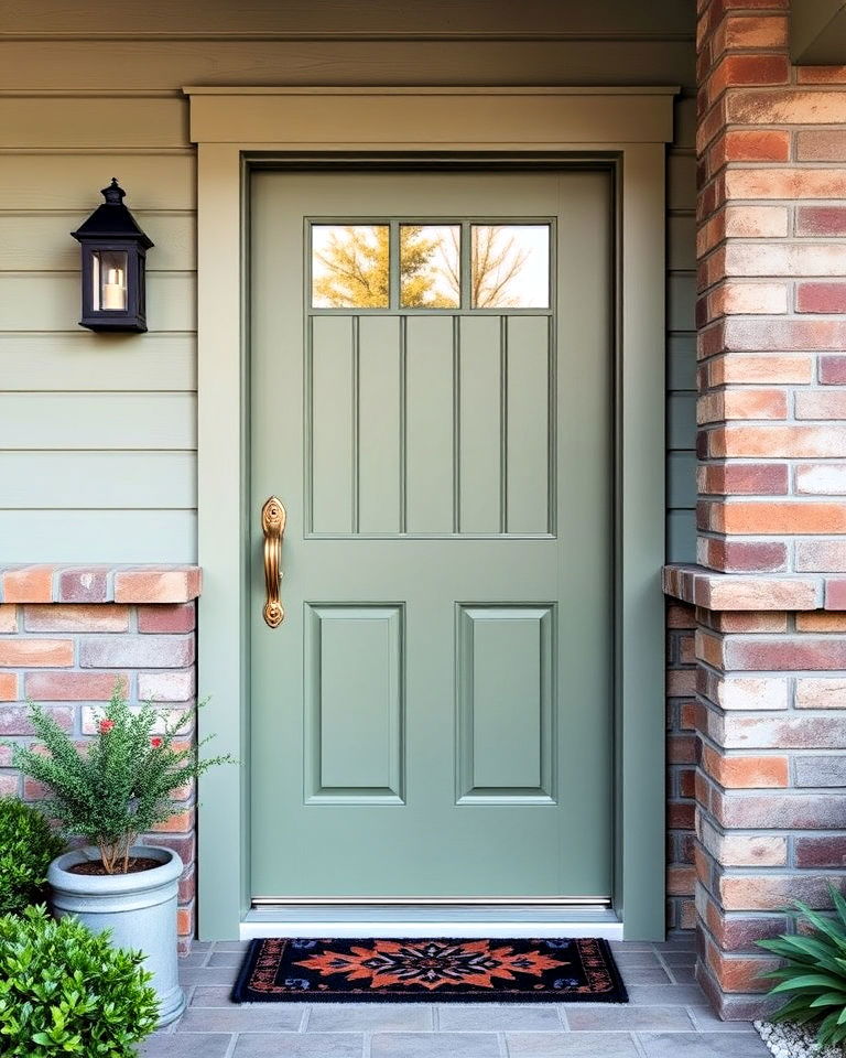
Sage green is a calming, earthy tone that fits seamlessly with mid-century design principles. This muted shade pairs effortlessly with natural materials like wood, stone, or brick, enhancing your home’s connection to the outdoors. Sage green offers a sophisticated yet understated look, perfect for those seeking a harmonious and timeless front door color. Add retro hardware for a cohesive design.
25. Eggplant Purple
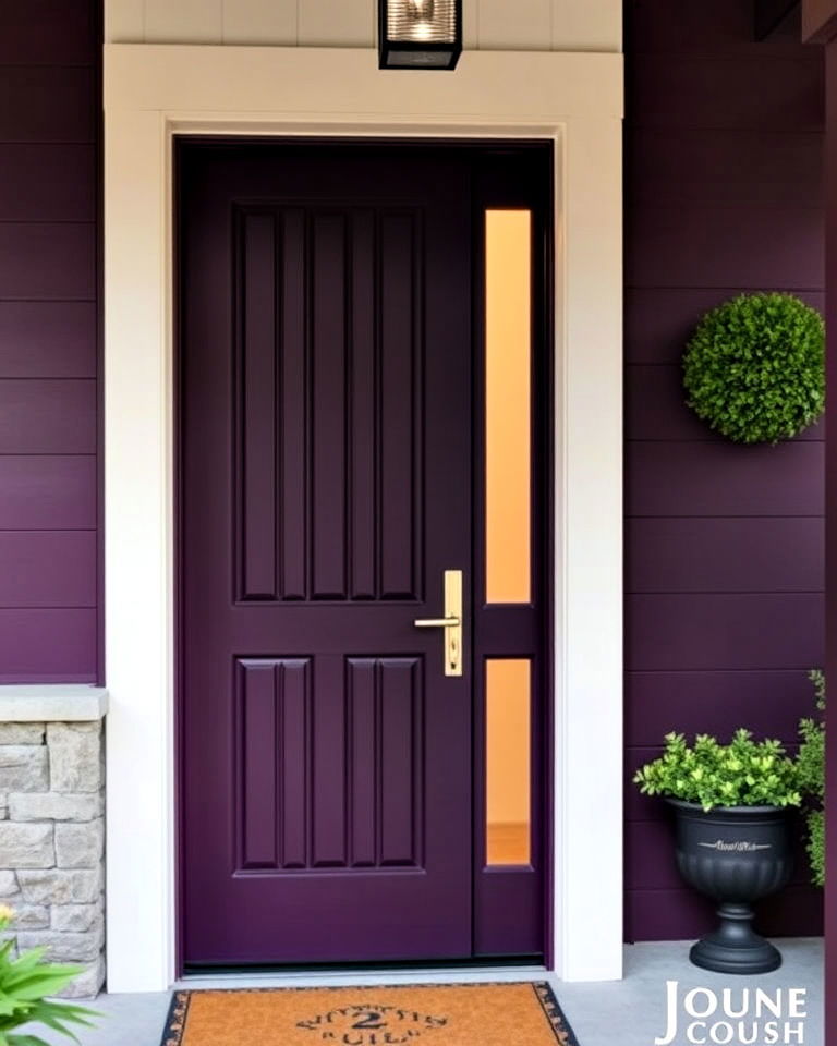
Eggplant purple adds depth and elegance to mid-century front doors, creating a bold yet refined statement. This rich, dark hue pairs beautifully with lighter exteriors, such as cream or gray, and complements wood or stone accents. Its luxurious appeal makes it an unconventional but striking choice for mid-century homes. Pair it with metallic hardware for a polished finish.
Conclusion:
Choosing the right front door color is an easy yet transformative way to elevate your home’s curb appeal. Mid-century modern design thrives on bold, harmonious hues that balance personality with sophistication. Whether you opt for vibrant teal, earthy olive, or cheerful tangerine, the right shade brings your entryway to life. Explore these timeless mid-century front door colors to create an exterior that stands out while blending beautifully with your home’s architectural charm.
Key Takeaways:
- Mid-Century Design Aesthetic: Front doors are more than functional; they embody bold, timeless statements that blend retro charm with modern elegance.
- Color as a Focal Point: Mid-century homes use vibrant and earthy door colors to enhance curb appeal, balancing striking contrasts with harmonious designs.
- Timeless Color Choices: Shades like vibrant teal, burnt orange, mustard yellow, and forest green encapsulate the era's innovative spirit while maintaining contemporary relevance.
- Materials and Pairings: Mid-century palettes work best with natural materials like wood, stone, or metallic accents in brass, chrome, or matte finishes.
- Enhancing Entryways: Colors not only define the door but also integrate seamlessly with exterior elements such as landscaping and architectural lines, creating cohesive designs.
What to Do Next:
- Evaluate Your Exterior Style: Assess your home’s architecture and surrounding features to select a door color that complements them.
- Choose a Standout Shade: Decide whether you want a vibrant hue (like tangerine or coral pink) or a subtle, earthy tone (like olive green or charcoal gray).
- Update Hardware: Pair your chosen color with mid-century-inspired hardware, such as sleek metallic finishes, for added authenticity.
- Incorporate Landscaping: Use plants, planters, and lighting that harmonize with your door color to complete the mid-century aesthetic.
- Test Before Painting: Sample a few colors to see how they look at different times of the day and under varying light conditions.

Leave a Reply